Search Information Visualization Database
infovis.info
1100+ examples of information visualization

home        .        about              

Search for:    Mode:
(ex: Paley, New York, subway, PIIM)

Found 25 results for "infovis":

470
1998 computer graphics by Emmanuel Frécon

WebPath is "... a tool that unobtrusively visualises a user's trail as they browse the Web", developed by Emmanuel Frécon, a researcher in the Distributed Collaborative Environments group at SICS, and Gareth Smith in the Computing Department, at Lancaster University.


See Frécon and Smith's 1998 paper for more information. "WebPath - A three-dimensional Web History", IEEE Symposium on Information Visualization (InfoVis '98), Chapel Hill. NC, USA.


986
2001 computer graphics by Ka-Ping Yee, Danyel Fisher, Rach

Presented at InfoVis 2001, this project presents a new animation technique for supporting interactive exploration of a graph using a radial tree layout method. As an alternative to trying to fit an entire graph into one view, this project provides exploration of subregions of the graph. Even if a graph is small enough to display all at once, it can be difficult to understand all of its relationships from only a single view. The ability to interactively view a graph from different perspectives can yield new insights.

The authors used a visualization paradigm in which the view of a graph is determined by the selection of a single node as the center of interest, or focus. The main contribution of this work is a new technique for animating the transitions from one view to the next in a smooth, appealing manner. The algorithm augments the well-known radial layout method by linearly interpolating the polar coordinates of the nodes and enforcing constraints on the new layout to keep it as similar as possible to the previous layout. When combined with a method for aggregating or eliding nodes far away from the focus, this technique can also provide an effective way to explore very large graphs.


1255
2007 Web by Daniele Galiffa using Actionscript

Analysis and experiments on relations into the Italian Blogosphere


I’ve been invited to join to the blogbabel initiative that aims to map the italian blogosphere. My effort in this interesting project is about to find some new, useful infovis-related solutions to offer some better cognitive tools to approach the Italian blog world and its relations. I started looking around to find interesting solutions about blog-mapping ( from the Manuel Lima’s blogviz, to the BlogoPole French initiative and the first BlogBabel visualization from Ludo).


What seemed to me really interesting is mainly the relations Analysis and not the Graph representation, because it tends to offer a “star-system” style visual environment that requires some more deep work in order to be used to understand how blogs are related each other.


My idea is really simple: suppose you have a line where you can use points to represent Blogs. Above the line I can have arches connecting a source blog (on the left side of the arch) to another (on the right side of the arch). Below the line I can have also arches, but the connection direction is from right to left.


The use of arches and circles come out from “The Shape of Songs” by Martin Wattenberg. In this way we have a LinksOut View (UP) and a LinksIn View (DOWN) and we could use the opacity of each arch to visualize how relations are relevant considering the numeber of links (in/out) among blogs.


The above description was modified from:


http://www.mentegrafica.it/blog/2007/05/10/analisys-and-experiments-on-relation-into-the-italian-blogosphere/


(images may be found at http://flickr.com/photos/danielegaliffa/tags/blogosphere/)


572
2005 computer graphics by Martin Wattenberg and Jonathan Feinberg

2005-08-29: "Color Code" - Interactive Map of the English Language

From InfoVis:Wiki

Martin Wattenberg and Jonathan Feinberg created Color Code, an astonishing interactive map of 33,000 English nouns:

A picture of 33,000 English nouns, grouped by meaning. Each word is given the average color of web images found when searching for that term.[Wattenberg and Feinberg, 2005]

A picture of 33,000 English nouns, grouped by meaning. Each word is given the average color of web images found when searching for that term.

[Wattenberg and Feinberg, 2005]

Color Code is a full-color portrait of the English language.

The artwork is an interactive map of more than 33,000 words. Each word has been assigned a color based on the average color of images found by a search engine. The words are then grouped by meaning. The resulting patterns form an atlas of our lexicon.

[Wattenberg and Feinberg, 2005]

via thedesignweblog

[Wattenberg and Feinberg, 2005] Martin Wattenberg and Jonathan Feinberg, Color Code: A Color Portrait of the English Language, Retrieved at: August 29, 2005. http://loop.aiga.org/resources/loop/loop9/colorproject/index.html


571
2005 computer graphics by Martin Wattenberg and Jonathan Feinberg

2005-08-29: "Color Code" - Interactive Map of the English Language

From InfoVis:Wiki

Martin Wattenberg and Jonathan Feinberg created Color Code, an astonishing interactive map of 33,000 English nouns:

A picture of 33,000 English nouns, grouped by meaning. Each word is given the average color of web images found when searching for that term.[Wattenberg and Feinberg, 2005]

A picture of 33,000 English nouns, grouped by meaning. Each word is given the average color of web images found when searching for that term.

[Wattenberg and Feinberg, 2005]

Color Code is a full-color portrait of the English language.

The artwork is an interactive map of more than 33,000 words. Each word has been assigned a color based on the average color of images found by a search engine. The words are then grouped by meaning. The resulting patterns form an atlas of our lexicon.

[Wattenberg and Feinberg, 2005]

via thedesignweblog

[Wattenberg and Feinberg, 2005] Martin Wattenberg and Jonathan Feinberg, Color Code: A Color Portrait of the English Language, Retrieved at: August 29, 2005. http://loop.aiga.org/resources/loop/loop9/colorproject/index.html


570
2005 computer graphics by Olivier Zitvogel

Delicous Soup shows related del.icio.us tags in a circular graph manner:

Delicious Soup - A tool that reveals your del.icio.us activities...

[Zitvogel, 2005]

via information aesthetics blog

[edit] 3 References

[Ivy, 2005] Ivy, Revealicious, Created at: 2005, Retrieved at: September 15, 2005. http://www.ivy.fr/revealicious/ [Zitvogel, 2005] Olivier Zitvogel, Delicous Soup, Created at: 2005, Retrieved at: September 15, 2005. http://www.zitvogel.com/delicioussoup/

Retrieved from "http://www.infovis-wiki.net/index.php?title=2005-09-15:_%22Revealicious%22_and_%22Delicious_Soup%22_-_two_Flash_based_del.icio.us_visualization_tools"


923
2005 computer graphics by Pak Chung Wong, Patrick Mackey,

These images are part of a paper presented at InfoVis'05, which describes a novel technique to visualize graphs with extended node and link labels. The lengths of these labels range from a short phrase to a full sentence to an entire paragraph and beyond. The proposed solution is different from existing approaches that rely on intensive computational effort to optimize the label placement problem. Instead, the authors share the visualization resources with the graph and present the label information in static, interactive, and dynamic modes without the requirement for tackling the intractability issues. This allows the reallocation of the computational resources for dynamic presentation of real-time information. The paper also includes a user study to evaluate the effectiveness and efficiency of this visualization technique.


565
2005 computer graphics by Lab Escape

2005-08-24: Integrating graphs into Treemaps

From InfoVis:Wiki

Lab Escape has integrated time-series graphs into their Treemap application Enterprise Tree Map 2.0

Demo of Enterprise Tree Map 2.0 showing stock market data. Time-series graphs of individual stocks are integrated into the Treemap[Lab Escape, 2005]

Demo of Enterprise Tree Map 2.0 showing stock market data. Time-series graphs of individual stocks are integrated into the Treemap

[Lab Escape, 2005]

via information aesthetics blog

[Lab Escape, 2005] Lab Escape, Screenshot of Enterprise Tree Map 2.0 Demo, Retrieved at: 2005-08-24, http://labescape.com/products/treemap/index.html


914
2004 computer graphics by Thomas Kapler, William Wright

Presented at the IEEE Symposium on Information Visualization (InfoVis 2004), Geotime by Thomas Kapler and William Wright is a project financed by NGA (National Geo-Spatial Intelligence Agency) and it aims to analyze observations over Time and Geography, which is always a particular hard task to achieve. This project is one of the best I've seen in dealing with the overlapping of these two realms. A working application of GeoTime is not available online, but for those who had the opportunity of seeing it working live, it proved to be a quite interesting interactive technique.

A visualization method was needed to improve perception of movements, events and relationships as they change over time within a spatial context. A combined temporal-spatial space was constructed in which to show interconnecting streams of events over a range of time in a single picture. Put simply, events are represented within an X,Y,T coordinate space, in which the X,Y plane shows geographic space and the Z-axis represents time into the future and past. In addition to providing the spatial context, the ground plane marks the instant of focus between before and after - events along the timeline "occur" when they meet the surface. Events are arrayed in time along time tracks, which are located wherever events occur within the spatial plane.


574
2006 computer graphics by Google

2006-03-27: Google Finance - Interactive Flash graphs to explore stock price data

From InfoVis:Wiki

Google Finance - Interactive Flash graphs to explore stock price data

[Google, 2006]

Interactive Flash graphs that combine stock price data in form of Line graphs (top) and sold volumes via Spike graphs (bottom). The data can be explored interactively providing Details on demand for each day; navigation can be performed via dragging the chart by mouse or moving the top Overview-plus-Detail slider. The current level of detail can be determined by dragging the overview window or selecting predefined granularities. Furthermore, company news are related to time by placing flags along the price chart.

Details: http://finance.google.com

via information aesthetics blog

[Google, 2006] Google, Finance BETA, Retrieved at: March 27, 2006. http://finance.google.com


563
20040609 computer graphics by Michal Migurski

2005-07-21: "In The News" - Interactive Visualization of Google News

From InfoVis:Wiki

Apart from the well known Newsmap visualization that utilizes Treemaps to present the current distribution of Google News topics, another very interesting visualization exists: In The News is the title of Michal Migurski's interactive Flash application that was posted already a year ago:

http://news.stamen.com/

In contrast to Newsmap that only shows current news, In The News adds temporal aspects via presenting the history of news topics over time. Thus, it allows for interactive exploration of the development of news topics over time.

In The News (Google News visualization)

[Migurski, 2004] Michal Migurski, In The News. Created at: June 9, 2004. Retrieved at: July 21, 2005. http://news.stamen.com/

* One week worth of news is represented in rows on the display.

* A single news topic is represented as color chip whereas the size of a chip denotes its relative importance on that day.

* Color is used to show whether an item has gained or lost importance relative to the previous day.

* When selecting a news topic, the corresponding color chips are highlighted and a small bar graph showing the topic's performance over the last month is shown below the main visualization.

* If a new topic is selected, another small bar graph is added while keeping the history of the last five selected topics visible and allowing for their comparison.

* Furthermore, news topics can be searched and lists of Top Names, Top Gainers, and Top Losers are provided.

The different views are very well coordinated and smooth transitions are provided, which adds to the coherent picture of the whole application making it an excellent example for a highly interactive exploration tool for time-oriented abstract data. And even nicer, the source code is available and released under a Creative Commons License.

via sendung.de blog

[Migurski, 2004] Michal Migurski, In The News. Created at: June 9, 2004. Retrieved at: July 21, 2005. http://news.stamen.com/


558
2005 computer graphics (processing.org) by Carolin Horn and Florian Jenett

2005-11-29: Jellyfish - visualization of an art encyclopedia (developed using processing.org)

From InfoVis:Wiki

Jellyfish visualizes an encyclopedia of the arts.

[Horn and Jenett, 2005]

Jellyfish visualizes an encyclopedia of the arts.

The project should be seen as an experiment, which deals with a dynamic interface. The purpose was to remove a static, conventional design and to achieve a playful interface.

The application is developed in Processing and uses an XML-database to update content.

[Horn and Jenett, 2005]

Homepage: http://www.carohorn.de/jellyfish/index.htm

[Horn and Jenett, 2005] Carolin Horn and Florian Jenett, Jellyfish - an encyclopedia of the arts, Created at: 2005, Retrieved at: November 29, 2005. http://www.carohorn.de/jellyfish/index.htm


568
2006 computer graphics by SmartMoney.com

2006-03-27: Market Radar: interactive data visualization of historical stock prices at SmartMoney.com

From InfoVis:Wiki

Market Radar - interactive data visualization of historical stock prices using dotplots

[SmartMoney.com, 2006]

THE MARKET RADAR is a new way to get a broad, historical view of stock prices. Our first radar tool displays nine years of weekly price changes for 500 companies — more than 200,000 data points in all. Presenting such a large database in a single picture makes it possible to see market dynamics that might otherwise be invisible.

[...]

Each weekly price change is represented by a single dot on the screen, colored green if the stock went up that week and red if it went down. Large movements are colored brightly, while smaller changes are dimmer. The dots are arranged in a grid, with each row representing a single company's performance, and columns representing points in time. The labels at top show the passage of time. The companies are grouped by sector and industry.

[SmartMoney.com, 2006]

Details: http://www.smartmoney.com/marketradar/

via information aesthetics blog

[SmartMoney.com, 2006] SmartMoney.com, Market Radar, Retrieved at: March 27, 2006. http://www.smartmoney.com/marketradar/


569
2005 computer graphics by Turner, T. C., Smith, M. A., Fisher, D., and Welser, H. T.

2005-08-26: New article on visualizion techniques for the Usenet

From InfoVis:Wiki

Treemap of January 2004 Usenet posts.

[Turner et al., 2005]

The current issue (10(4), 2005) of the Journal of Computer-Mediated Communication contains a special theme on "Online Communities". One of the articles is about information visualization techniques used for the Usenet:

Picturing Usenet: Mapping Computer-Mediated Collective Action

[Turner et al., 2005] Turner, T. C., Smith, M. A., Fisher, D., and Welser, H. T. Picturing Usenet: Mapping computer-mediated collective action. Journal of Computer-Mediated Communication, 10(4), article 7, 2005.


564
2004 computer graphics by Martin Krzywinski

2005-08-24: "Schemaball" - Schema Viewer for SQL Databases

From InfoVis:Wiki

Visualization of a MySQL Database schema [Krzywinski, 2004]

Schemaball is a flexible schema visualizer for SQL databases. The purpose of Schemaball is to help visualize the relationships between tables. Tables are related by foreign keys, which are fields which store the value of a record field from another table. Foreign keys create a lookup relationship between two tables. Large schemas can have hundreds of tables and table relationships. Keeping track of them call can be tedious, error-prone and slow down the schema development process. Schemaball provides a means to create flexible, static graphic images of a schema. Tables and table links can be hidden, highlighted and foreign key relationships can be traversed forward or backward to highlight connected tables.

Schemaball produces images called schema balls. Schema balls are schema visualizations in which tables are ordered along a circle with table relationships drawn as curves or straight lines. Using an input configuration file, all elements of the schema ball can be configured.

Schemaball is free software, licensed under GPL. It is written in Perl and requires a few CPAN modules to run. It's simple to use, while being able to produce high quality schema balls suitable for publication. In particular, you can use Schemaball to generate elements of a schema ball and then create a composite in an image editing program. One such result is shown in the figure at right.

[Krzywinski, 2004]

via information aesthetics blog

[Krzywinski, 2004] Martin Krzywinski, Schemaball - Schema Viewer for SQL Databases, Created at: 2004, Retrieved at: 2005-08-24, http://mkweb.bcgsc.ca/schemaball/


567
2006 computer graphics by Dietmar Offenhuber and Gerhard Dirmoser

2006-05-24: SemaSpace - Graph editor for large knowledge networks

From InfoVis:Wiki

SemaSpace - Graph editor for large knowledge networks

[Offenhuber and Dirmoser, 2006]

SemaSpace is a fast and easy to use graph editor for large knowledge networks, specially designed for the application in non technical sciences and the arts. It creates interactive graph layouts in 2d and 3d by means of a flexible algorithm. The system is powerful enough for the calculation of complex networks and can incorporate additional data such as images, sounds and full texts.

[Offenhuber and Dirmoser, 2006]

Details: http://residence.aec.at/didi/FLweb/

[Offenhuber and Dirmoser, 2006] Dietmar Offenhuber and Gerhard Dirmoser, SemaSpace, Retrieved at: May 24, 2006. http://residence.aec.at/didi/FLweb/


561
20050603 computer graphics by CNET Networks

2005-10-04: "The Big Picture" - Ontology viewer for cnet.com articles

From InfoVis:Wiki

The Big Picture is an online ontology viewer that is applied to c|net News.com articles to show relationships between stories, companies, and topics. It allows for a completely new and very interesting way of exploring news stories. The tool has been developed in cooperation with Liveplasma.com (formerly MusicPlasma).

The Big Picture - Ontology viewer that connects stories, companies, and topics within the News.com website. The example shows the network centered around the article Apple to ditch IBM, switch to Intel chips.[CNET, 2005a]

The Big Picture - Ontology viewer that connects stories, companies, and topics within the News.com website. The example shows the network centered around the article Apple to ditch IBM, switch to Intel chips.

[CNET, 2005a]

via information aesthetics blog

[edit] References

* [CNET, 2005a] CNET Networks. The Big Picture. Retrieved at: October 4, 2005. http://beta.news.com.com/The+Big+Picture/2030-12_3-5843390.html?

* [CNET, 2005b] CNET Networks. Apple to ditch IBM, switch to Intel chips. Created at: June 3, 2005. Retrieved at: October 4, 2005. http://beta.news.com.com/Apple+to+ditch+IBM%2C+switch+to+Intel+chips/2100-1006_3-5731398.html?tag=nl


560
2006 computer graphics by Tom Carden

2006-01-25: Travel Time Tube Map

From InfoVis:Wiki

Travel Time Tube Map - Screenshot of an processing Applet that distorts the London underground network circularly according to travel times from a selected station.[Carden, 2006]

Travel Time Tube Map - Screenshot of an processing Applet that distorts the London underground network circularly according to travel times from a selected station.

[Carden, 2006]

Travel Time Tube Map is a processing Applet that distorts the London underground network circularly according to travel times from a selected station.

Homepage: http://www.tom-carden.co.uk/p5/tube_map_travel_times/applet/

[Carden, 2006] Tom Carden, Travel Time Tube Map, created at: January 1, 2006, retrieved at: January 25, 2006. http://www.tom-carden.co.uk/p5/tube_map_travel_times/applet/


562
2005 computer graphics by codecubed.com

2005-07-18: Treemap representation of del.icio.us most popular bookmarks

From InfoVis:Wiki

Treemap representation of del.icio.us bookmarks [codecubed.com, 2005]

codecubed.com offers a treemap represenation of the most popular bookmarks in the del.icio.us online social bookmarks manager:

http://codecubed.com/map.html

via information aesthetics blog

[codecubed.com, 2005] dgottfrid@gmail.com, Retrieved: July 19, 2005. http://codecubed.com/map.html


963
2005 computer graphics by Yarden Livnat, Jim Agutter, Shau

Presented at the Infovis 2005 Conference in Minneapolis, MN (USA), VisAware reveals a novel visual correlation paradigm that takes advantage of human perceptive and cognitive facilities in order to enhance users' situational awareness and support decision-making.

The first image reflects VisAware used in a Biowatch scenario where its structure classifies agents in colored sections around a ring. It shows the different categories of biological agents and the different types of chemical agents (i.e. blistering and nerve agents). With the map in the middle, it is easy to correlate the presence of agents to the sensor that detected it. The correlating line has a variable width that shows the probability of the agent under analysis; the thicker the line the greater the probability of an actual attack.

The second image shows VisAlert, a visualization method for network intrusion detection. The authors based their approach on representing the network alerts as connections between two domains. These two domains are a one dimensional domain representing the node attribute, and a two-dimensional domain representing the time and type attributes. A network alert instance, in this scheme, is thus a straight line from a point in the type-time domain to a point in the node domain. They choose to separate the node attribute from the type and time as nodes provide a more or less static set of objects that can be used as visualization anchors for the transient alert instances.


629

Voronoi Treemaps

200510 computer graphics by Michael Balzer, Oliver Deussen

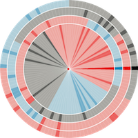
Treemaps are a well-known method for the visualization of at-

tributed hierarchical data. Previously proposed Treemap layout

algorithms are limited to rectangular shapes, which causes prob-

lems with the aspect ratio of the rectangles as well as with identify-

ing the visualized hierarchical structure. The approach of Voronoi

Treemaps presented in this paper eliminates these problems through

enabling subdivisions of and in polygons. Additionally, this allows

for creating Treemap visualizations within areas of arbitrary shape,

such as triangles and circles, thereby enabling a more flexible adap-

tation of Treemaps for a wider range of applications.

...

Similarly to the other Treemap layout algorithms, enhancements

like borders, adaptive edge sizes, cushions, coloring, etc., may also

be applied to the described layout method. This additionally sup-

ports the user in the perception and interpretation of the Treemap

visualization. Examples for such enhanced Voronoi Treemap lay-

outs are presented in Figures 10–12.

Figure 10: Enhanced AW Voronoi Treemap layout of 4075 nodes at

10 hierarchy levels (a brighter color indicates a lower hierarchy level)

Figure 11: Enhanced PW Voronoi Treemap layout of 16288 nodes at

7 hierarchy levels (a brighter color indicates a lower hierarchy level)


559
2005 computer graphics by Michal Migurski

2005-09-02: "In The News" moves from Google News to del.icio.us tags and is now called "Vox Delicii"

From InfoVis:Wiki

Michal Miguski's interesting work In The News (see 2005-07-21: "In The News" - Interactive Visualization of Google News) abandoned the visualization of Google News entries due to various issues regarding Google's News service and moved over to visualizing del.icio.us bookmark tags.

The only downside is the disappearance of the Search functionality...

Vox Delicii (del.icio.us bookmarks visualization)

[Migurski, 2005]

Related Information

* 2005-07-18: Treemap representation of del.icio.us most popular bookmarks

* 2005-07-21: "In The News" - Interactive Visualization of Google News

[Migurski, 2005] Michal Migurski, Vox Delicii. Created at: August 3, 2005. Retrieved at: September 2, 2005. http://news.stamen.com/vox/


471
1998 computer graphics by Emmanuel Frécon

WebPath is "... a tool that unobtrusively visualises a user's trail as they browse the Web", developed by Emmanuel Frécon, a researcher in the Distributed Collaborative Environments group at SICS, and Gareth Smith in the Computing Department, at Lancaster University.


See Frécon and Smith's 1998 paper for more information. "WebPath - A three-dimensional Web History", IEEE Symposium on Information Visualization (InfoVis '98), Chapel Hill. NC, USA.


813
computer graphics by Emmanuel Frecon and Gareth Smith

These images show WebPath, "... a tool that unobtrusively visualises a user's trail as they browse the Web", developed by Emmanuel Frecon, a researcher in the Distributed Collaborative Environments group at SICS, and Gareth Smith in the Computing Department, at Lancaster University.

For more information see Frecon and Smith's 1998 paper for more information. "WebPath - A three-dimensional Web History, IEEE Symposium on Information Visualization (InfoVis' 98), Chapel Hill. NC, USA."


575
20060525 computer graphics by Aharef Weblog

2006-05-29: Websites as graphs

From InfoVis:Wiki

Website as graph

Structure of http://www.infovis-wiki.net

[Aharef, 2006]

Everyday, we look at dozens of websites. The structure of these websites is defined in HTML, the lingua franca for publishing information on the web. Your browser's job is to render the HTML according to the specs (most of the time, at least). You can look at the code behind any website by selecting the "View source" tab somewhere in your browser's menu.

HTML consists of so-called tags, like the A tag for links, IMG tag for images and so on. Since tags are nested in other tags, they are arranged in a hierarchical manner, and that hierarchy can be represented as a graph. I've written a little app that visualizes such a graph, and here are some screenshots of websites that I often look at.

I've used some color to indicate the most used tags in the following way:

blue: for links (the A tag)

red: for tables (TABLE, TR and TD tags)

green: for the DIV tag

violet: for images (the IMG tag)

yellow: for forms (FORM, INPUT, TEXTAREA, SELECT and OPTION tags)

orange: for linebreaks and blockquotes (BR, P, and BLOCKQUOTE tags)

black: the HTML tag, the root node

gray: all other tags

[Aharef, 2006]

Details: http://www.aharef.info/2006/05/websites_as_graphs.htm

[Aharef, 2006] Aharef Weblog, Websites as graphs, Created at: May 25, 2006, Retrieved at: May 29, 2006, http://www.aharef.info/2006/05/websites_as_graphs.htm