Found 44 results for "population":
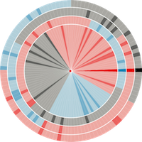
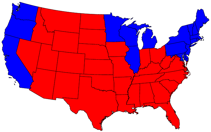
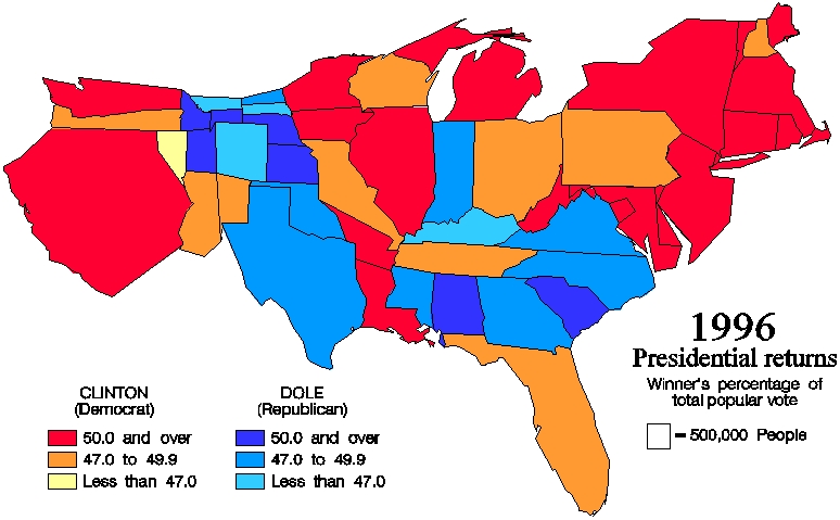 540 540 | computer graphics The results of the popular vote in the 1996 U.S. presidential race are visualized above using traditional thematic mapping. Each state is colored either a shade of red or a shade of blue, denoting the majority winner of each state as Clinton or Dole, respectively, with color saturation indicating the magnitude of the winning percentage. There is a significant problem with this visualization. Without prior knowledge of population density across the country, the viewer has no clear indicator as to who actually won the election. While this map provides a medium of familiarity, it produces an intrinsic distortion of the very data we are trying to analyze. Since elections are not won on square miles, the results would be better visualized on a map more representative of population. These same election results are shown below on a 1996 equal population cartogram generated using the Constraint-Based Method. |
 539 539 | 1997 computer graphics by Kocmoud and House Animation of the 1996 U.S. Population Cartogram construction process Demonstration of "alternating relaxation" in the the Constraint-Based Method where the focus alternates between achieving correct region areas and restoring region shapes (Kocmoud and House, 1997). |
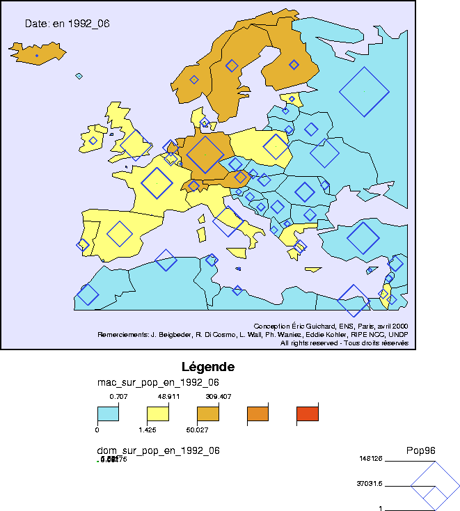 271 271 | 2000 computer graphics by Éric Guichard, École Normale Supérieure, Paris, France Example frame from an animated map tracking the growth of the Internet in Europe through the 1990s. Several different map animations were produced by Éric Guichard, at the École Normale Supérieurecole Normale Supérieure, Paris, using national level data from RIPE. Countries are colour-coded according to hosts per capita and the green circles show domains per capita. (Blue diamonds show the 1996 national population.) |
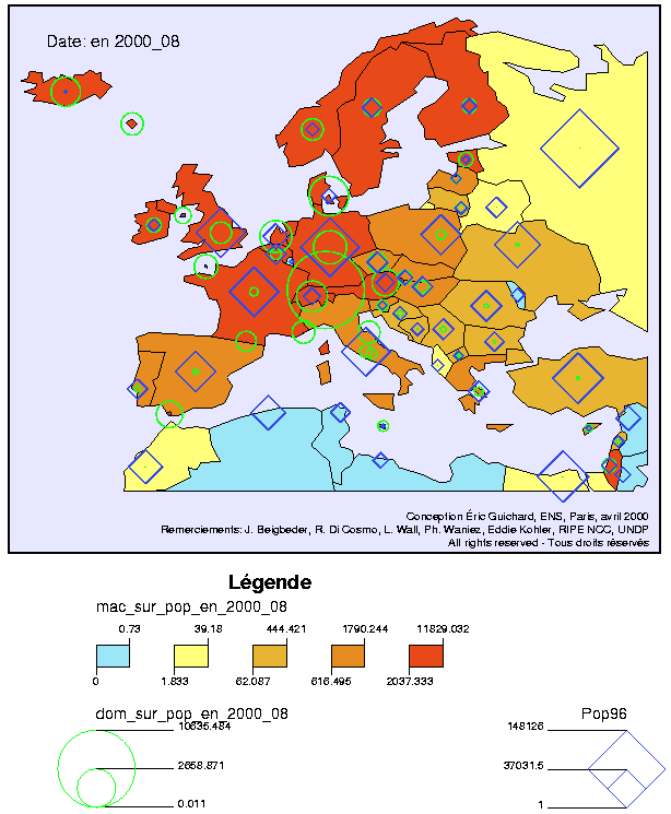 272 272 | 2000 computer graphics by Éric Guichard, École Normale Supérieure, Paris, France Example frame from an animated map tracking the growth of the Internet in Europe through the 1990s. Several different map animations were produced by Éric Guichard, at the École Normale Supérieurecole Normale Supérieure, Paris, using national level data from RIPE. Countries are colour-coded according to hosts per capita and the green circles show domains per capita. (Blue diamonds show the 1996 national population.) |
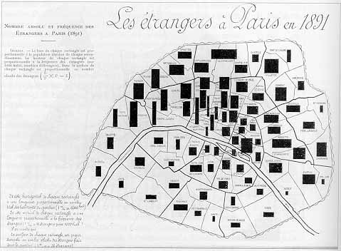 77 77 | 1896 print by Jacques Bertillon (1851-1922), France Use of area rectangles on a map to display two variables and their product (population of arrondisements in Paris, percent foreigners; area = absolute number of foreigners). Bertillon, J. (1896). Fréquence des étrangers à Paris en 1891. In Cours élementaire de statistique administrative. Paris: Societé d'éditions scientifiques. (map). Palsky, G. (1996). Des Chiffres et des Cartes: Naissance et développement de la cartographie quantitative française au XIXe siècle . Paris: Comité des Travaux Historiques et Scientifiques (CTHS). ISBN 2-7355-0336-3. (Fig. 85) |
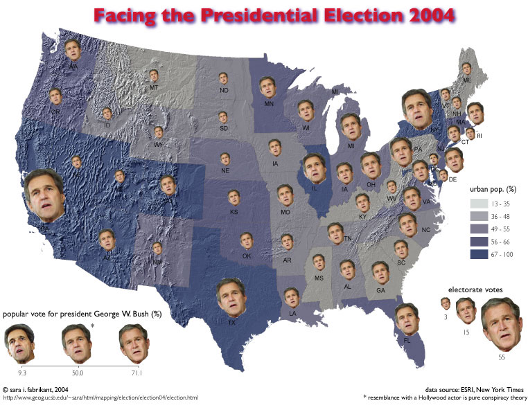 628 628 | 2004 computer graphics by Sara I. Fabrikant Another problem with the ubiquitous blue/red choropleth map is that only one piece of information is shown, namely, who won which state. Inspired by statistician Hermann Chernoff's faces the map on the left depicts four variables at once: 1) the continuously scaled face* represents the number of electorate votes per state (the larger the face the more votes), 2) the continuously morphed face between Sen. Kerry and President Bush depicts the percent of popular vote for President Bush. The fewer votes for Bush, the more the face resembles Sen. Kerry, 3) the choropleth shading indicates the percentage of urban population in each state, and finally 4) relief shading gives a sense of the physical terrain across the nation. |
 160 160 | 1991 by Jason Dykes and David Unwin There are many difficulties in showing rates of incidence or proportions in maps, when both the areas of geographic regions, and the populations in those regions vary, often inversely. In spatial epidemiology, for example, Standardized Mortality Ratios are often used, expressing the ratios of the number of deaths in each area to those expected on the basis of some externally specified (typically national) age-sex specific rates. This figure uses a Chi-square metric to depict the distribution of number of cars, O, in each ward in Leicestershire, UK, expressed as a signed chi-square contribution, (Oi - Ei)/ Ö Ei, relative to the expected number, E, per capita. A diverging colour scheme applies hues of red and blue to those areas with higher and lower than expected values with colour saturation showing the magnitude of the variation. Thus whiter zones are close to the expected value and deeper blues and fuller reds show the extremes. This map still confounds area and population with visual impact, which the use of a cartogram base, with circle areas proportional to the population, helps avoid. Figures from Maps of the Census: A Rough Guide, by Jason Dykes and David Unwin (http://www.agocg.ac.uk/reports/visual/casestud/dykes/abstra_1.htm). Abstract: This Case Study describes the considerations that are needed to produce maps of data from the Census of Population. The `area value' or choropleth map is the standard means of displaying such information on paper. It is a very imperfect visualisation device. First, it is necessary to be careful about the numbers that are mapped and, in particular, never to map absolute numbers. Second, choropleth maps are very sensitive to the mapping zones being used. To produce maps that do not distort the underlying distributions it is necessary to understand how the zones were defined and the effects of their varying sizes on the mapped pattern. Third, there are a series of strictly cartographic considerations related to how these maps are classed and the symbolism used. All of these issues are illustrated using data from the 1991 Population Census for Leicestershire, UK. These problems lead to a consideration of the need to develop new mapping tools. Dynamic maps can take advantage of an interactive software environment to overcome some of the limitations of the static map. The possibilities which they provide for interactive engagement with data make them appropriate tools for exploratory analysis, or visual thinking. A mapping tool is introduced, which exemplifies this form of map use and examples of the techniques that might be used to visualize the UK Census of Population are provided. |
 701 701 | 2006 computer graphics by Mark Newman Cartogram of child mortality. Technical details: These cartograms were created using a variant of the diffusion algorithm of Gastner and Newman. Data for the population cartogram were taken from the Gridded Population of the World compiled by the International Center for Earth Science at Columbia University; elevation and bathymetric data were taken from the NOAA 2-minute Gridded Global Relief data set. Data for the other cartograms came from the United Nations Statistics Division and from the databases of the World Health Organization. In all of the cartograms on this page, Antarctica has been treated the same as the sea, meaning its area is unchanged although its shape may be distorted slightly to make room for changes in the sizes of other parts of the world. |
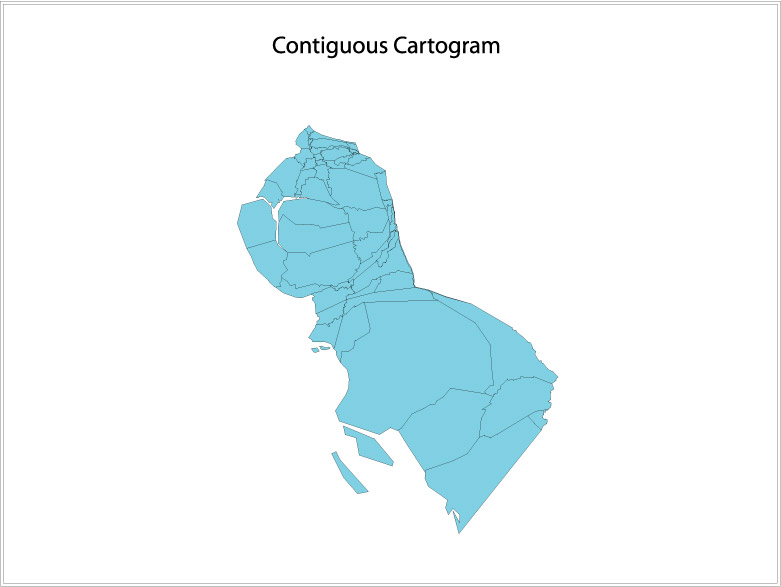 549 549 | computer graphics In the previous section we referred to the connectivity between objects, or topology. In a non-contiguous cartogram topology was sacrificed in order to preserve shape. In a contiguous cartogram, the reverse is true- topology is maintained (the objects remain connected with each other) but this causes great distortion in shape. This leads to the single most difficult, but intriguing problem in creating cartograms. The cartographer must make the objects the appropriate size to represent the attribute value, but he or she must also maintain the shape of objects as best as possible, so that the cartogram can be easily interpreted. Here is an example of a contiguous cartogram of population in California's counties. Compare this to the previous non-contiguous cartogram. |
 81 81 | 1874 print by L.L. Vauthier, France Population contour map (population density shown by contours), the first statistical use of a contour map. Vauthier, L. L. (1874). Note sur une carte statistique figurant la répartition de la population de Paris. Comptes Rendus des Séances de L'Académie des Sciences, 78:264-267. ENPC: 11176 C612. |
 50 50 | 1801 print by William Playfair (1759-1823), England Invention of the pie chart, and circle graph, used to show part-whole relations. Playfair, W. (1801). Statistical Breviary; Shewing, on a Principle Entirely New, the Resources of Every State and Kingdom in Europe . London: Wallis. Re-published in Wainer, H. and Spence, I. (eds.), The Commercial and Political Atlas and Statistical Breviary, 2005, Cambridge University Press, ISBN 0-521-85554-3. |
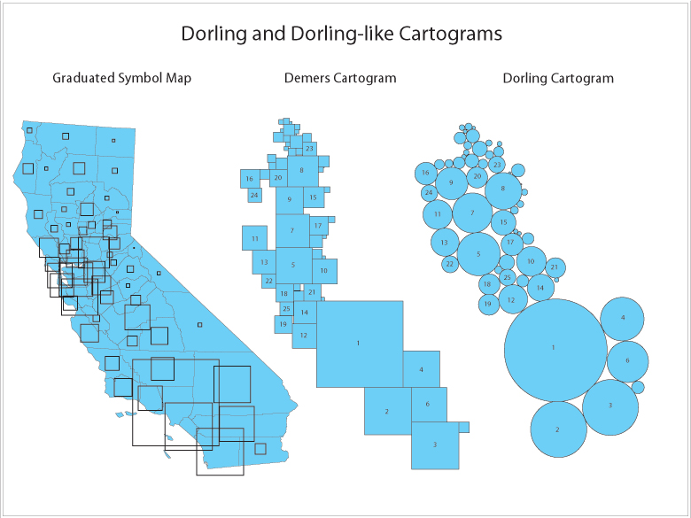 550 550 | computer graphics by Danny Dorling of the University of Leeds This type of cartogram was named after its inventor, Danny Dorling of the University of Leeds. A Dorling cartogram maintains neither shape, topology nor object centroids, though it has proven to be a very effective cartogram method. To create a Dorling cartogram, instead of enlarging or shrinking the objects themselves, the cartographer will replace the objects with a uniform shape, usually a circle, of the appropriate size. Professor Dorling, for the reason described above in the non-contiguous cartogram section, suggests that the shapes not overlap but rather be moved so that the full area of each shape can be seen. Below is an example of a Dorling cartogram, using the same population of California counties example. Another Dorling-like cartogram is the Demers Cartogram, which is different in two ways. It uses squares rather than circles; this leaves fewer gaps between the shapes. Secondly, the Dorling Cartogram attempts to move the figures the shortest distance away from their true locations; the Demers cartogram often sacrifices distance to maintain contiguity between figures, and it will also sacrifice distance to maintain certain visual cues (The gap between figures used to represent San Francisco Bay in the Demers Cartogram below is a good example of a visual cue.) The 25 Most Populated Counties in California are labeled in each of the two cartograms below for reference. |
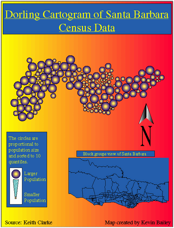 542 542 | computer graphics by Kevin Bailey (source: Keith Clarke) The circles are proportional to population size and sorted to 10 quantiles. |
 58 58 | 1830 Print by Armand Joseph Frère de Montizon (1788-?), France First simple dot map of population by department, 1 dot = 10,000 people. Frère de Montizon, A. J. (1830). Carte philosophique figurant la population de la France. BNF. Robinson, A. H. (1982). Early Thematic Mapping in the History of Cartography . Chicago: University of Chicago Press. ISBN 0-226-72285-6. |
 710 710 | 2004 computer graphics by Michael Gastner, Cosma Shalizi, and Mark Newman (University of Michigan) With a map of US counties colored red and blue to indicate Republican and Democratic majorities respectively, there is more red than blue, even after allowing for population sizes. Of course, we know that nationwide the percentages of voters voting for either candidate were almost identical, so what is going on here? The answer seems to be that the amount of red on the map is skewed because there are a lot of counties in which only a slim majority voted Republican. One possible way to allow for this, suggested by Robert Vanderbei at Princeton University, is to use not just two colors on the map, red and blue, but instead to use red, blue, and shades of purple to indicate percentages of voters. Here is what the normal map looks like if you do this. |
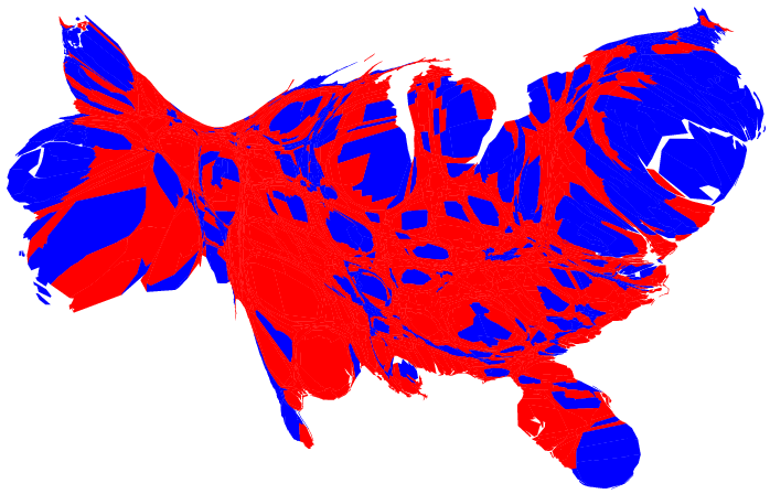 709 709 | 2004 computer graphics by Michael Gastner, Cosma Shalizi, and Mark Newman (University of Michigan) This a cartogram for the county-level election returns. The blue areas are much magnified, and areas of blue and red are now nearly equal. However, there is in fact still more red than blue on this map, even after allowing for population sizes. Of course, we know that nationwide the percentages of voters voting for either candidate were almost identical, so what is going on here? The answer seems to be that the amount of red on the map is skewed because there are a lot of counties in which only a slim majority voted Republican. |
 706 706 | 2004 computer graphics by Michael Gastner, Cosma Shalizi, and Mark Newman
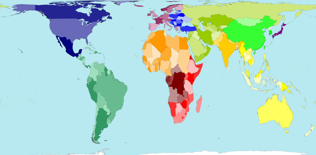
Michael Gastner, Cosma Shalizi, and Mark Newman (University of Michigan) The (contiguous 48) states of the country are colored red or blue to indicate whether a majority of their voters voted for the Republican candidate (George W. Bush) or the Democratic candidate (John F. Kerry) respectively. The map gives the superficial impression that the "red states" dominate the country, since they cover far more area than the blue ones. However, as pointed out by many others, this is misleading because it fails to take into account the fact that most of the red states have small populations, whereas most of the blue states have large ones. The blue may be small in area, but they are large in terms of numbers of people, which is what matters in an election. We can correct for this by making use of a cartogram, a map in which the sizes of states have been rescaled according to their population. That is, states are drawn with a size proportional not to their sheer topographic acreage -- which has little to do with politics -- but to the number of their inhabitants, states with more people appearing larger than states with fewer, regardless of their actual area on the ground. Thus, on such a map, the state of Rhode Island, with its 1.1 million inhabitants, would appear about twice the size of Wyoming, which has half a million, even though Wyoming has 60 times the acreage of Rhode Island. |
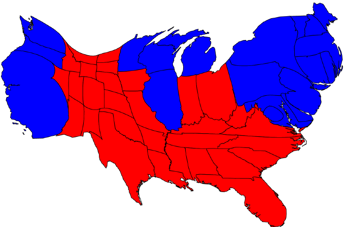 707 707 | 2004 computer graphics by Michael Gastner, Cosma Shalizi, and Mark Newman (University of Michigan) Here are the 2004 presidential election results on a population cartogram. The cartogram was made using the diffusion method of Gastner and Newman. Population data were taken from the 2000 US Census. The cartogram reveals what we know already from the news: that the country was actually very evenly divided by the vote, rather than being dominated by one side or the other. The presidential election is not decided on the basis of the number of people who vote each way, however, but on the basis of the electoral college. Each state contributes a certain number of electors to the electoral college, who vote according to the majority in their state. The candidate receiving a majority of the votes in the electoral college wins the election. The electoral votes are apportioned roughly according to states' populations, as measured by the census, but with a small but deliberate bias in favor of smaller states. To represent the effects of the electoral college, the sizes of states have been scaled to be proportional to their number of electoral votes. This cartogram looks very similar to a popular vote cartogram, but it is not identical. Wyoming, for instance, has approximately doubled in size, precisely because of the bias in favor of small states. The areas of red and blue on the cartogram are now proportional to the actual numbers of electoral votes won by each candidate. Thus this map shows at a glance both which states went to which candidate and which candidate won more votes -- something that you cannot tell easily from the normal election-night red and blue map. |
 704 704 | 2006 computer graphics by Mark Newman Cartogram of energy consumption (including oil). Technical details: These cartograms were created using a variant of the diffusion algorithm of Gastner and Newman. Data for the population cartogram were taken from the Gridded Population of the World compiled by the International Center for Earth Science at Columbia University; elevation and bathymetric data were taken from the NOAA 2-minute Gridded Global Relief data set. Data for the other cartograms came from the United Nations Statistics Division and from the databases of the World Health Organization. In all of the cartograms on this page, Antarctica has been treated the same as the sea, meaning its area is unchanged although its shape may be distorted slightly to make room for changes in the sizes of other parts of the world. |
 750 750 | 2005 computer graphics by Gustavo G Network analysis of the Flickr population, based on data collected on March 14th, 2005. |
| | 1837 print by Henry Drury Harness (1804-1883), Ireland First published flow maps, showing transportation by means of shaded lines, widths proportional to amount (passengers). Harness, H. D. (1838). Atlas to Accompany the Second Report of the Railway Commissioners, Ireland . Dublin: H.M.S.O. (a) Map showing the relative number of passengers in different directions by regular public conveyances, 80 x 64 cm; (b) map showing the relative quantities of traffic in different directions, 80 x 64 cm; (c) map showing by varieties of shading the comparative density of the population, 80 x 64 cm. Robinson, A. H. (1955). The 1837 maps of Henry Drury Harness. Geographical Journal, 121:440-450. Robinson, A. H. (1982). Early Thematic Mapping in the History of Cartography . Chicago: University of Chicago Press. ISBN 0-226-72285-6. |
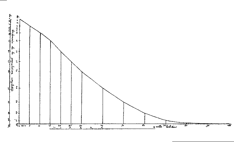 55 55 | 1821 print by Jean Baptiste Joseph Fourier (1768-1830), France Ogive or cumulative frequency curve, inhabitants of Paris by age groupings (shows the number of inhabitants of Paris per 10,000 in 1817 who were of a given age or over. The name "ogive" is due to Galton.). Fourier, J. B. J. (1821). Notions generales, sur la population. Recherches Statistiques sur la Ville de Paris et le Departement de la Seine, 1:1-70. |
 977 977 | 2004 computer graphics by (unknown) Understanding the results of genetic programming can be a daunting task. Are the trees being generated correctly? Are recombination and mutation happening as desired? Which branches are more stable than others - where is the evolution taking place?rnrnGenetic Programming TreeVisualizer is a free, open source function tree rendering and visualization Java code that can quickly answer some of these questions. It allows seeing what a tree looks like from one generation to the next. One could view the best individual per generation in a sequence of images to see how evolution is affecting the population. This heuristic feel for what is going on could provide valuable insight and inspiration for any Genetic Programming experiment. |
 705 705 | 2006 computer graphics by Mark Newman Cartogram of greenhouse gas emissions. Technical details: These cartograms were created using a variant of the diffusion algorithm of Gastner and Newman. Data for the population cartogram were taken from the Gridded Population of the World compiled by the International Center for Earth Science at Columbia University; elevation and bathymetric data were taken from the NOAA 2-minute Gridded Global Relief data set. Data for the other cartograms came from the United Nations Statistics Division and from the databases of the World Health Organization. In all of the cartograms on this page, Antarctica has been treated the same as the sea, meaning its area is unchanged although its shape may be distorted slightly to make room for changes in the sizes of other parts of the world. |
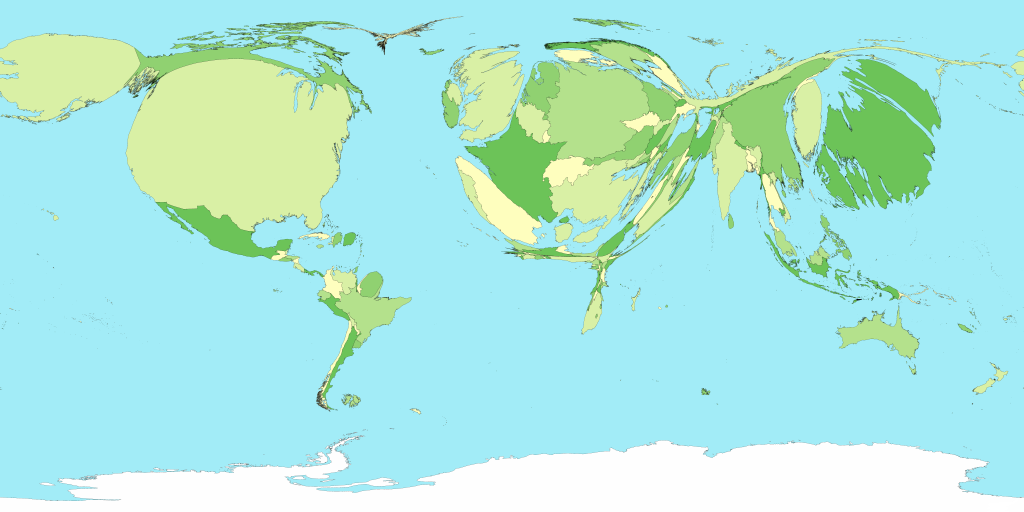 700 700 | 2006 computer graphics by Mark Newman Cartograms are most often used to show population data, but there is no reason why they need be limited to population. They can in principle be used to show almost any quantity. Here is a cartogram of the world in which the sizes of countries are proportional to Gross Domestic Product, which is a measure of how much wealth a country's economy generates, and hence, to an extent, of the wealth of the country's inhabitants. Notice how America and Europe dominate this map, along with Japan (yes – that huge dark-green island on the right really is Japan), while Africa dwindles almost to invisiblity. Technical details: These cartograms were created using a variant of the diffusion algorithm of Gastner and Newman. Data for the population cartogram were taken from the Gridded Population of the World compiled by the International Center for Earth Science at Columbia University; elevation and bathymetric data were taken from the NOAA 2-minute Gridded Global Relief data set. Data for the other cartograms came from the United Nations Statistics Division and from the databases of the World Health Organization. In all of the cartograms on this page, Antarctica has been treated the same as the sea, meaning its area is unchanged although its shape may be distorted slightly to make room for changes in the sizes of other parts of the world. |
 692 692 | 2006 computer graphics by Mark Newman, Danny Dorling Each territory's size on the map is drawn according to its land area. The total land area of these 200 territories is 13,056 million hectares. Divided up equally that would be 2.1 hectares for each person. A hectare is 100 metres by 100 metres. However, population is not evenly spread: Australia's land area is 21 times bigger than Japan's, but Japan's population is more than six times bigger than Australia's. |
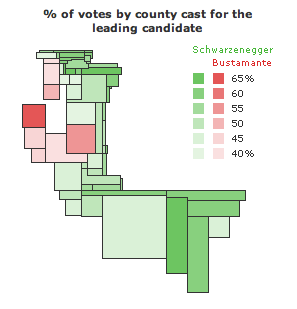 588 588 | 2003 computer graphics by Jonathon Corum County maps and the 2003 California Statewide Special Election. County maps can be deceptive, especially for large states like California. Unless the population of a state is dispersed evenly in proportion to the size of each county, there is no direct relationship between the physical area of a county and the number of people, registered voters, or votes cast within it. Which is why I was surprised to see an analyst from a leading all-news television network point to a map of California and single out San Bernadino county, California's largest county by area, as a significant reason for Arnold Schwarzenegger's victory. I saw a similar map on the day after the election, a map of leading gubernatorial candidates by county, provided as part of California's official election results and reproduced at right. What's wrong with this map? The official county map shows at least four things: the location and size of each county (as a surface area), the leading candidate within that county (as a color), and the percentage of votes cast for that candidate (as a number). The map legend adds the statewide totals and the percentage of votes cast for each of the top 10 candidates. The map is correct in showing that Schwarzenegger won this election, but the map doesn't fit the data very well. The tally of votes gives him 48.6% of the total, but almost all of the map is green. Stretching or condensing data to fit a physical area often results in visual misrepresention or exaggeration, and I was curious to find out how much the county map exaggerates the voting data. Does area matter? After removing captions, text, and drop shadows, the map shows a total of 86,031 colored pixels. Of that total, 81,560 pixels (95%) are Schwarzenegger green, and 4,471 pixels (5%) are Bustamante red. |
 696 696 | 2006 computer graphics by Mark Newman, Danny Dorling Territory size shows the proportion of worldwide net imports of meat (in US$) that are received there. Net imports are imports minus exports. When exports are larger than imports the territory is not shown. If everybody living in Andorra spent the same amount on net meat imports, they would each spend US$405 annually. Whilst this is the highest per person spending in the world, Andorra has a relatively small population. It is Japan that brings in the highest absolute total net meat imports, accounting for a quarter of the world total. Japan (the only territory that is an entire region) has the highest regional imports, of the five regions that do have net meat imports. Northern Africa has the lowest. When comparing net regional totals Japan accounts for half of net meat imports by value. |
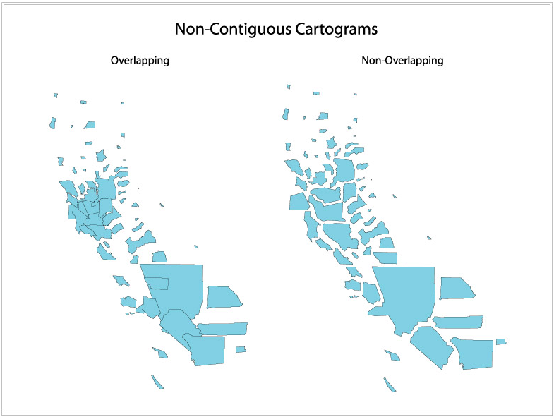 554 554 | computer graphics A non-contiguous cartogram is the simplest and easiest type of cartogram to make. In a non-contiguous cartogram, the geographic objects do not have to maintain connectivity with their adjacent objects. This connectivity is called topology. By freeing the objects from their adjacent objects, they can grow or shrink in size and still maintain their shape. Here is an example of two non-contiguous cartograms of population in California's counties. The difference between these two types of non-contiguous cartograms is a significant one. The cartogram on the left has maintained the object's centroid (a centroid is the weighted center point of an area object.) Because the object's center is staying in the same place, some of the objects will begin to overlap when the objects grow or shrink depending on the attribute (in this case population.) In the cartogram on the right, the objects not only shrink or grow, but they also will move one way or another to avoid overlapping with another object. Although this does cause some distortion in distance, most prefer this type of non-contiguous cartogram. By not allowing objects to overlap, the depicted sizes of the objects are better seen, and can more easily be interpreted as some attribute value. |
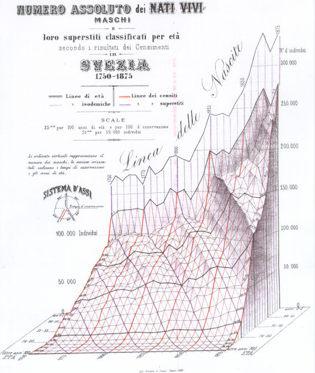 101 101 | 1879 print by Luigi Perozzo, Italy Stereogram (three-dimensional population pyramid) modeled on actual data (Swedish census, 1750-1875). Perozzo, L. (1880). Della rappresentazione graphica di una collettività di individui nella successione del tempo. Annali di Statistica, 12:1-16. BL: S.22. |
 702 702 | 2006 computer graphics by Mark Newman Cartogram of people living with HIV/AIDS. Technical details: These cartograms were created using a variant of the diffusion algorithm of Gastner and Newman. Data for the population cartogram were taken from the Gridded Population of the World compiled by the International Center for Earth Science at Columbia University; elevation and bathymetric data were taken from the NOAA 2-minute Gridded Global Relief data set. Data for the other cartograms came from the United Nations Statistics Division and from the databases of the World Health Organization. In all of the cartograms on this page, Antarctica has been treated the same as the sea, meaning its area is unchanged although its shape may be distorted slightly to make room for changes in the sizes of other parts of the world. |
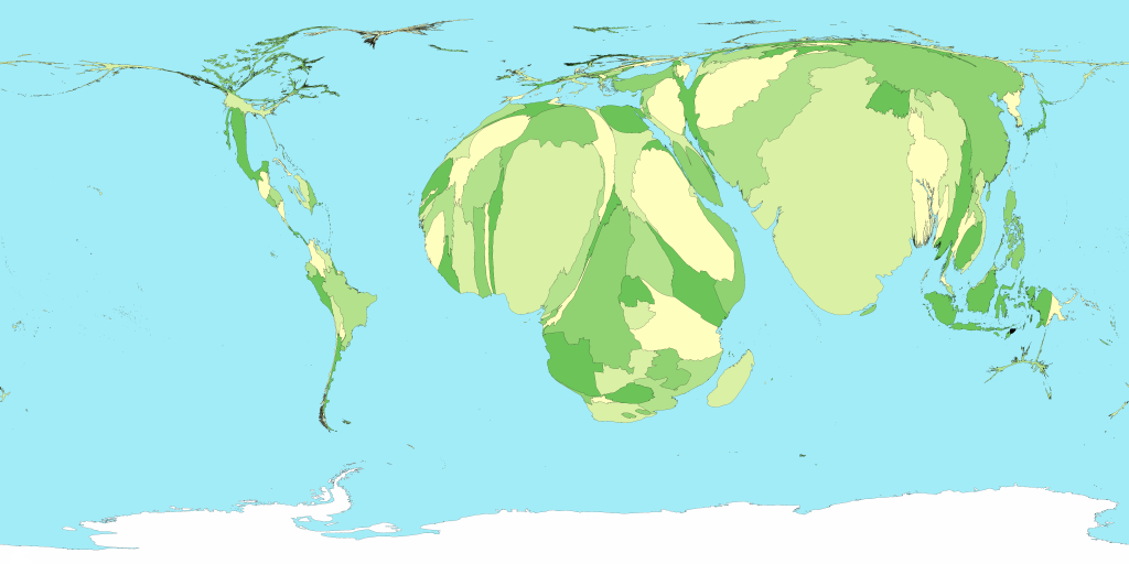
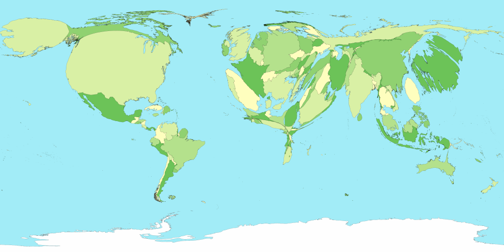
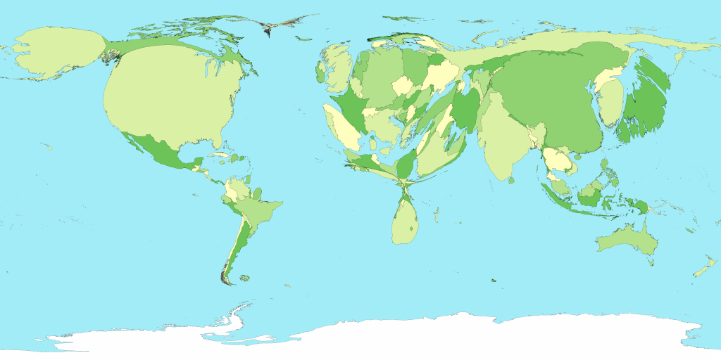
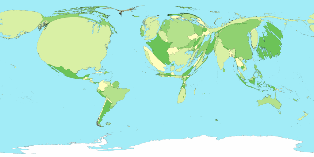
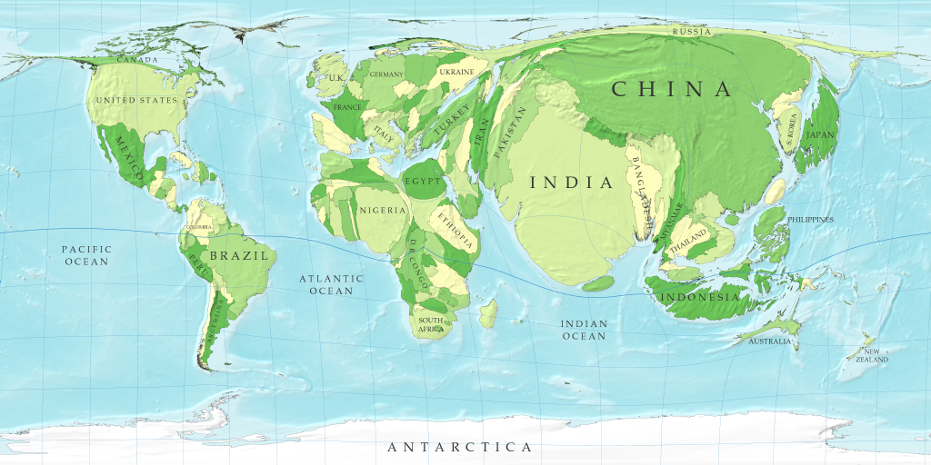 699 699 | 2006 computer graphics by Mark Newman, Danny Dorling In this map the sizes of countries are proportional not to their actual landmass but instead to the number of people living there; a country with 20 million people, for instance, appears twice as large as a country with 10 million. Although the figures for populations of countries are well established and familiar to many, the cartogram provides a new way of looking at them and in particular makes clear the enormous disparity in the population of different regions. Note how large India and China have become: between them these two countries account for more than a third of the population of the world. On the other hand, notice the near-disappearance of Canada and Russia, the world's two largest countries by land area, which have relatively few people in them. Notice also how the lines of latitude and longitude have become distorted by the growing and shrinking countries. This is an unavoidable consequence of the cartogram transformation: in order to give the countries the right sizes and still have them fit together you need to warp things a bit. The method used here, however, does a pretty good job of keeping the map recognizable. Technical details: These cartograms were created using a variant of the diffusion algorithm of Gastner and Newman. Data for the population cartogram were taken from the Gridded Population of the World compiled by the International Center for Earth Science at Columbia University; elevation and bathymetric data were taken from the NOAA 2-minute Gridded Global Relief data set. Data for the other cartograms came from the United Nations Statistics Division and from the databases of the World Health Organization. In all of the cartograms on this page, Antarctica has been treated the same as the sea, meaning its area is unchanged although its shape may be distorted slightly to make room for changes in the sizes of other parts of the world. |
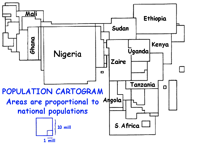 545 545 | computer graphics Areas are proportional to national populations. |
 89 89 | 1874 print by Francis Amasa Walker (Superintendent of U.S. Census) (1840-1897), USA Age pyramid (bilateral histogram), bilateral frequency polygon, and the use of subdivided squares to show the division of population by two variables jointly (an early mosaic display) in the first true U.S. national statistical atlas. Walker, F. A. (1874). Statistical Atlas of the United States, Based on the Results of Ninth Census, 1870, with Contributions from Many Eminent Men of Science and Several Departments of the [Federal] Government. New York: Julius Bien. |
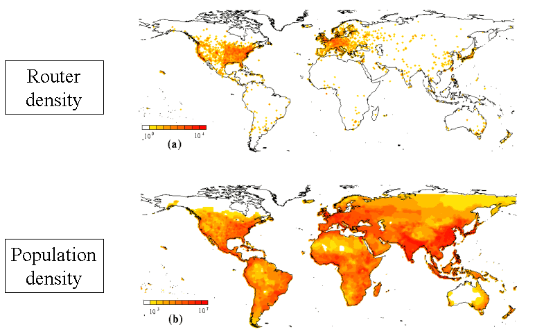 322 322 | computer graphics by Soon-Hyung Yook, Hawoong Jeong and Albert-Laszlo Barabasi, University of Notre Dame This map compares the geographic distribution of Internet routers (top) against the global distribution of population (bottom). It was produced by Soon-Hyung Yook, Hawoong Jeong, and Albert-Laszlo Barabasi at the University of Notre Dame as part of their research in the network structure of the Internet. For more information see their paper, Modeling the Internet's large scale topology, July 2001. |
 117 117 | 1927 print by J. N. Washburne, USA Spate of articles on experimental tests of statistical graphical forms: R. von Huhn, F. E. Croxton, J. N. Washburne, USA. Washburne, J. N. (1927). An experimental study of various graphic, tabular and textual methods of presenting quantitative material. Journal of Educational Psychology, 18:361-376, 465-476. von Huhn, R. (1927). A discussion of the Eells' experiment. Journal of the American Statistical Association, 22:31-36. Croxton, F. E. (1927). Further studies in the graphic use of circles and bars. Journal of the American Statistical Association, 22:36-39. Croxton, F. E. and Stein, H. (1932). Graphic comparisons by bars, squares, circles and cubes. Journal of the American Statistical Association, 27:54-60. Croxton, F. E. and Stryker, R. E. (1927). Bar charts versus circle diagrams. Journal of the American Statistical Association, 22:473-482. |
 171 171 | 2003 print by Israel Bureau of Statistics The crusty pie chart gets a new topping! A pie chart depicts a partition. A Spie chart combines two pie charts to compare partitions. One pie chart is drawn as-is, and serves as the basis for comparison. The other is superimposed on the first, using the same angles for the slices, but different radii, so as to achieve the desired areas. The example shows road casualties data from Israel. The base pie chart shows the general population parititoned into gender and age groups. The superimposed chart shows the same partitioning for the population of road casualties. Obviously the main age group hit is 20--24, and males are much more often involved in accidents that females. Reference: D. G. Feitelson, "Comparing Partitions with Spie Charts". Technical Report 2003-87, School of Computer Science and Engineering, The Hebrew University of Jerusalem, Dec 2003. URL: http://www.cs.huji.ac.il/~feit/papers/Spie03TR.pdf |
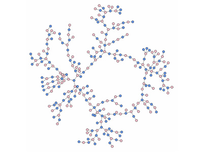 762 762 | computer graphics by Bearman PS, Moody J, Stovel K. "Understanding the structure of sexual networks is critical for modeling disease transmission dynamics, if disease is spread via sexual contact. This project describes the structure of an adolescent sexual network among a population of over 800 adolescents residing in a mid-sized town in the mid-western United States. Precise images and measures of network structure are derived from reports of relationships that occurred over a period of eighteen months between 1993 and 1995. We compare the structural characteristics of the observed network to simulated networks governed by similar constraints on the distribution of ties, and show that the observed structure differs radically from chance expectation. Specifically, we find that real sexual and romantic networks are characterized by long contact chains and few cycles. We identify the micro-mechanism that generates networks with similar structural features to the observed network. Implications for disease transmission dynamics and social policy are explored." |
 703 703 | 2006 computer graphics by Mark Newman Cartogram of total spending on healthcare. Technical details: These cartograms were created using a variant of the diffusion algorithm of Gastner and Newman. Data for the population cartogram were taken from the Gridded Population of the World compiled by the International Center for Earth Science at Columbia University; elevation and bathymetric data were taken from the NOAA 2-minute Gridded Global Relief data set. Data for the other cartograms came from the United Nations Statistics Division and from the databases of the World Health Organization. In all of the cartograms on this page, Antarctica has been treated the same as the sea, meaning its area is unchanged although its shape may be distorted slightly to make room for changes in the sizes of other parts of the world. |
 693 693 | 2006 computer graphics by Mark Newman, Danny Dorling Territory size shows the proportion of the world international tourist trips made by residents of that territory abroad. The international tourists that made 665 million trips in 2003 were primarily residents of Western Europe, North America and Eastern Europe. Very few tourists came from Central Africa, South Eastern Africa and Southern Asia. International tourism includes both crossing into a neighbouring country and taking a trans-oceanic flight. On average the residents of Antigua and Barbuda left their islands 3.66 times per year – at the other extreme residents of Angola left on average 0.0002 times per year. In other words less than 0.02% of the Angolan population made tourist visits abroad in 2003. |
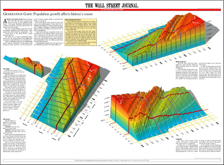 597 597 | computer graphics by Karl Hartig Three views of a three-dimensional model created with U.S. Census data. The model is a visualization of the distribution of people in the U.S. population from birth to age 100, for each year from 1900 through 2050. The wave down the middle is the Baby Boom moving though time. The valley in front of it is the effect of The Great Depression on the birth rate. |
 153 153 | 1983 computer graphics by Mark Monmonier, USA Visibiltiy Base Map, a map of the United States where areas are adjusted to provide a readily readable platform for area symbols for smaller states, such as Delaware and Rhode Island, with compensating reductions in the size of larger states. Monmonier, M. and Schnell, G. (1983). The Study of Population: Elements, Patterns, Processes. Columbus, OH: Charles E. Merrill. |
 739 739 | 1995 computer graphics by Judith S. Donath The population of a real-world community creates many visual patterns. Some are patterns of activity: the ebb and flow of rush hour traffic or the swift appearance of umbrellas at the onset of a rain-shower. Others are patterns of affiliation, such as the sea of business suits streaming from a commuter train, or the bright t-shirts and sun-glasses of tourists circling a historic site.rnrnVisual Who makes these patterns visible. It creates an interactive visualization of the members' affiliations and animates their arrivals and departures. The visualization uses a spring model. The user chooses groups (for example, subscribers to a mailing-list) to place on the screen as anchor points. The names of the community members are pulled to each anchor by a spring, the strength of which is determined by the individual's degree of affiliation with the group represented by the anchor. The visualization is dynamic, with the motion of the names contributing to the viewer's understanding of the underlying data. |
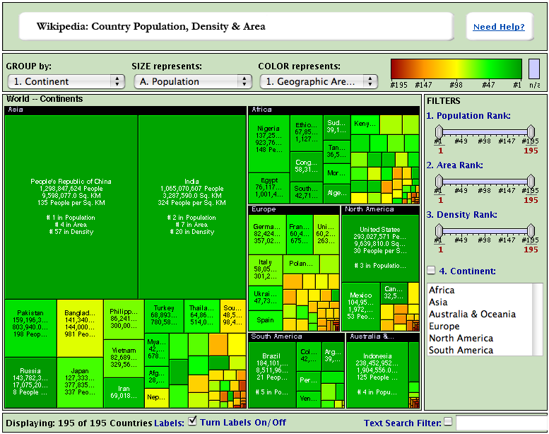 636 636 | computer graphics (interactive) by The Hive Group Wikipedia: Country Population, Density & Area Each square in the Honeycomb map is a country. A Brief Explanation * Population, population density, and geographic area estimates used in this map are taken from the CIA Factbook 2004, a wonderful public domain source of information. There are 191 United Nations member states depicted in the map. Also included are Taiwan, Vatican City, the West Bank, and the Gaza Strip. As we have likely made a great number of typographical errors in entering the information, we encourage you to take this data with more than a grain of salt: Please apply salt liberally. If you discover an error that simply demands fixing, please email us. (Note: We've updated the map to reflect 2004 population figures.) * We have played rather fast and loose with the continents. Betraying what some might call a continent-centric bias, all island nations belong to continents. We've treated Australia and the surrounding island groupings as Australia & Oceania, a label that is certain to raise someone's ire. For purposes of simplicity, We have interpreted Asia and North America very broadly, with each corresponding roughly to the area that it would occupy in the board game Risk™. All countries have been assigned a primary continent. For purposes of this map, Russia and Turkey are in Asia. * Many countries have populations and geographical area added to their totals on the basis of protectorate or commonwealth holdings. These countries have notes that appear within their mouseover boxes, indicating that their totals are somewhat inflated by additional territories. The only "double-counting" in the map — areas included in one country's total but also considered independently — are the Gaza Strip & the West Bank, which are both included in Israel's total and included as separate entries. We did not include these regions in this manner as a political statement, but rather to note the remarkable population density of the Gaza Strip. Had these areas been solely included in Israel's total, the Gaza Strip's decidedly urban character would be lost on the user. * Yes, Denmark includes Greenland. Denmark by itself is just not that big and has a relatively dense population. Since Greenland is humungous and not very populous, Denmark's population density ends up being, well, not very high. * Make sure and click on a few countries to view their Wikipedia entries. Wikipedia is a community-maintained encyclopedia, and it is a peerless source of organized general information. * The Most Incredible Tidbit We Learned While Building the Map: Russia is more than 100x as large as Bangladesh, but the two have very similiarly sized populations. |