Found 20 results for "plot":
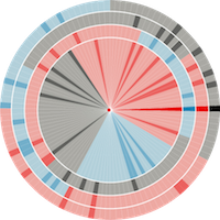
 1009 1009 | 2006 computer graphics by Tom Carden Inspired by Christian Nold's Biomapping project, this processing applet developed by Tom Carden is a visualisation of GPS data from people walking on the Greenwich peninsula (London, UK). The height of the mesh is a measure of GSR (Galvanic Skin Response, related to stress levels) at that point. As Tom Carden explains: "since I didn't split out the individual walks from the sample data this shouldn't really be considered an accurate map of stress in Greenwich!". The Bio Mapping project allows the wearer to record their Galvanic Skin Response (GSR), which is a simple indicator of emotional arousal in conjunction with their geographical location. This can be used to plot a map that highlights point of high and low arousal. By sharing this data one can construct maps that visualise where a community might feel stressed and excited. |
 1024 1024 | 2005 computer graphics by Martin Krzywinski
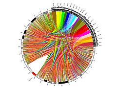
From the creator of Schemaball, Circos is designed for visualizing alignments, conservation and intra- and inter-chromosomal relationships within a genome, between genomes, or between any two or more sets of objects with a corresponding distance scale. Circos is written in Perl to be a flexible and extensible tool for the generation of publication-quality, circularly composited renditions of genomic data and related annotations.
Circos produces static images. Eventually, Circos will produce HTML image maps to make images interactive. Support exists for creating images with non-linear distance scales. The magnification level of genomic regions can be set independently and without cropping. Scale smoothing ensures that the magnification changes smoothly across the ideogram.
Circos is driven by an Apache-like configuration file and accepts data from flat files. It is very easy to plot, format and layer the data with Circos. A large variety of plot and feature parameters are customizable, helping you make the image that best communicates your data. Some data, like combinations of intra- and inter-chromosomal relationships (alignments, duplications, assembly paired-ends, etc) are very difficult to organize when the underlying ideograms (or contigs) are arranged as lines. In many cases, it is impossible to keep the relationship lines from crossing other structures and this deteriorates the effectiveness of the graphic.
|
 135 135 | 1999 computer graphics by Leland Wilkinson (1944-), USA
Grammar of Graphics: A comprehensive systematization of grammatical rules for data and graphs and graph algebras within an object-oriented, computational framework.
Wilkinson, L. (1999). The Grammar of Graphics. New York: Springer. ISBN 0-387-98774-6.
|
 124 124 | 1973 print by Herman Chernoff (1923-), USA
Cartoons of human face to represent multivariate data.
Chernoff, H. (1973). The use of faces to represent points in k-dimensional space graphically. Journal of the American Statistical Association, 68:361-368.
|
 24 24 | 1686 print by Edmond Halley (1656-1742), England
Bivariate plot of a theoretical curve derived from observations (barometric pressure vs. altitude), graphical analysis based on empirical data.
Halley, E. (1686). On the height of the mercury in the barometer at different elevations above the surface of the earth, and on the rising and falling of the mercury on the change of weather. Philosophical Transactions , 16 :104-115.
|
 112 112 | 1911 print by Elnar Hertzsprung (1873-1967), Denmark
The Hertzsprung-Russell diagram, a log-log plot of luminosity as a function of temperature for stars, used to explain the changes as a star evolves. It provided an entirely new way to look at stars, and laid the groundwork for modern stellar physics and evolution, developed independently by Elnar Hertzsprung (1873-1967), Denmark [127] and Henry Norris Russell (1877-1957), USA. See (Spence, below) for a recent appraisal.
Hertzsprung, E. (1911). Publikationen des astrophysikalischen observatorium zu Potsdam. Num. 63.
Spence, I. and Garrison, R. F. (1993). A remarkable scatterplot. The American Statistician, 47 (1):12-19.
|
 166 166 | 1994 computer graphics (MANET) by George Hawkins, Heike Hoffman, and Bernd Siegel
Categorical data are often shown as tables of frequencies, cross-classified by two or more discrete variables. Interactive mosaic plots can display complex multivariate relationships surprisingly clearly. Interaction is essential to query the displays (because axis descriptions become messy in several dimensions) and to reorder the displays to emphasise different features.
This plot, from the Augsburg MANET software, shows survival rates by gender, age and class from the Titanic disaster. The left lower section shows how female adult survival rates declined with class and the right lower section reveals that the pattern of male rates was different. Reordering by class, age and gender would highlight the comparison of male and female rates by class and the poor survival rate of children in the third class. [Thanks to Antony Unwin for this contribution.]
|
 68 68 | 1846 print by Léon Lalanne (1811-1892), France
Logarithmic grid (the first log-log plot, as a nomogram for showing products from the factors).
Lalanne, L. (1846). Mémoire sur les tables graphiques et sur la géométrie anamorphique appliquées a diverses questions qui se rattachent a l'art de l'ingénieur. Annales des Ponts et Chausées, 2e series, 11:1-69. Read 1843.
|
 417 417 | computer graphics by Martin Wattenberg
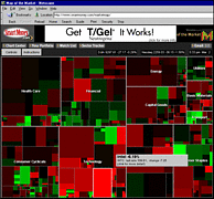
Map of the Market, from SmartMoney.com, maps the stock performance of 500 US corporation. Individual companies are represented by different plots of land sized according to their market capitalisation. The colour of the plot indicates recent changes in stock price.
|
 105 105 | 1913 print by Henry Gwyn Jeffreys Moseley (1887-1915), England
Discovery of the concept of atomic number, based largely on graphical analysis (a plot of serial numbers of the elements vs. square root of frequencies from X-ray spectra) The linear relations showed that the periodic table was explained by atomic number rather than, as had been supposed, atomic weight, and predicted the existence of several yet-undiscovered elements.
Moseley, H. (1913). The high frequency spectra of the elements. Philosophical Magazine, 26:1024-1034. (Part II, 27:1914, pp.703-).
|
 243 243 | print by Charles Joseph Minard
A graphical display of the time course of Minard's works reveals some interesting patterns. The plot below shows the time course of Minard's graphic output with a smooth (loess) curve, in relation to some events in his life. Tick marks at the top and bottom show the date of each each graphic work, categorized by content (related to the distribution of Goods vs. Other topics).
|
 102 102 | 1873 print by R. A. Fisher, c.1955, after Josiah Willard Gibbs (1839-1903), USA
Graphical methods applied to explain fundamental relations in thermodynamics; this includes diagrams of entropy vs. temperature (where work or heat is proportional to area), and the first use of trilinear coordinates (graphs of (x,y,z) where x+y+z=constant).
Bumstead, H. A. (ed.) (1961). The Scientific Papers of J. Willard Gibbs . New York: Dover Publications, Inc. (an unabridged republication of the work originally published by Longmans, Green and Company in 1906).
Gibbs, J. W. (1873). Graphical methods in the thermodynamics of fluids. Transactions of the Connecticut Academy of Arts and Sciences, 2:309-342. Reprinted in Bumstead (above).
Gibbs, J. W. (1873). A method of geometrical representation of the thermodynamic properties of substances by means of surfaces. Transactions of the Connecticut Academy of Arts and Sciences, 2:382-404. Reprinted in Bumstead (above).
|
 127 127 | 1972 print by David F. Andrews, Canada
Form of Fourier series to generate plots of multivariate data.
Andrews, D.F. (1972). Plots of high dimensional data. Biometrics, 28:125-136.
|
 164 164 | 1975 computer graphics
The scatterplot matrix displays the relationships among all pairs of many variables. This example shows the relation among three measures of social competence, but the data in each plot are stratified by the type of setting. To aid perception of how the relations differ across setting, each subplot is enhanced with a data ellipse showing the strength of the relationship. The diagonal panels show the univariate distribution of each variable, again stratified by type of setting. Color is used effectively to keep the settings visually distinct.
|
 131 131 | 1971 print by J. H. Siegel, R. M. Goldwyn, and Herman P. Friedman, USA
Irregular polygon ("star plot") to represent multivariate data (with vertices at equally spaced intervals, distance from center proportional to the value of a variable) [but see Georg von Mayr in 1877 [S.78] for first use].
Siegel, J.H., Goldwyn, R.M., and Friedman, H.P. (1971). Pattern and process of the evolution of human septic shock. Surgery, 70:232-245.
Mayr, G.v. (1877). Die Gesetzmäßigkeit im Gesellschaftsleben. Oldenbourg.
|
 167 167 | computer graphics
It is difficult to compare the means of several groups on many variables. Profile or parallel coordinate plots are often confusing when the curves for different groups cross a great deal. The multivariate star plot shows each of an arbitrary number of variables on radial axes from the origin, here for the means of automobile models, classified by region of manufacture.
In this plot, the variables Price, Gear Ratio and Turning Circle are reflected so larger values represent "better" for all variables; then all variables are first scaled to a 0-1 range. Variables are arranged around the circle by a multivariate effect ordering according to their order on the largest discriminant dimension. The error bars next to each radial axis shows the smallest value of a difference between means required for a (univariate) .05 significant difference.
|
 59 59 | 1844 Print by Charles Joseph Minard (1781-1870), France
"Tableau-graphique" showing transportation of commercial traffic by variable-width (distance), divided bars (height ~ amount), area ~ cost of transport [An early form of the mosaic plot.].
Minard, C. J. (May 1844). Tableaux figuratifs de la circulation de quelques chemins de fer. lith. (n.s.). ENPC:5860/C351, 5299/C307.
Dainville, F. d. (Oct. 1970). Les bases d'une cartographie industrielle de L'Europe au XIXe siècle. Tech. Rep. 540, Centre National de la Recherch Scientifique, Lyon. Colloques Internationaux du C.N.R.S.
Robinson, A. H. (1967). The thematic maps of Charles Joseph Minard. Imago Mundi, 21 :95-108.
|
 687 687 | 200512 computer graphics (RRDtool) by Sylwester Arabas
We use rrdtool to plot some basic meteorological parameters. Data is coming from our institute's (http://www.igf.fuw.edu.pl/zfa/en/) meteo-station which was build from scratch by students. Rrdtool fetch command is also used for creation of datafiles available on the website.
|
 177 177 | 1991 print by R. A. Fisher
Figure 3: A dotplot of the barley data showing yield against site and year given variety.
The figure is a Trellis display of data from an agricultural field trial of barley yields at six sites in Minnesota; ten varieties of barley were grown in each of two years. The data were presented by R. A. Fisher in The Design of Experiments and analyzed subsequently by many others.
William Cleveland's display of these data shows an apparent surprise missed by previous investigators, which occurs at the Morris site: For all other sites, 1931 produced a significantly higher overall yield than 1932. The reverse is true at Morris. But most importantly, the amount by which 1932 exceeds 1931 at Morris is similar to the amounts by which 1931 exceeds 1932 at the other sites. More displays, a statistical modeling of the data, and some background checks on the experiment led to the conclusion that the data are in error -- the years for Morris were inadvertently reversed. The background of the data, and analysis with Trellis are described in more detail in The Visual Design and Control of Trellis http://www.research.att.com/areas/stat/doc/95.8.color.ps).
The graph uses main effect ordering to arrange the 6 sites and 10 barley varieties from bottom to top according to increasing values of the median yields (collapsed over other factors). This greatly aids perception of trends in the data and makes the Morris data stand out as unusual.
|
 67 67 | 1846 print by Léon Lalanne (1811-1892), France
Logarithmic grid (the first log-log plot, as a nomogram for showing products from the factors).
Lalanne, L. (1846). Mémoire sur les tables graphiques et sur la géométrie anamorphique appliquées a diverses questions qui se rattachent a l'art de l'ingénieur. Annales des Ponts et Chausées, 2e series, 11:1-69. Read 1843.
|
 1009
1009  127
127 