Found 272 results for "network traffic ":
 360 360 | computer graphics CESNET is the Czech educational and scientific network. Unfortunately, the map is no longer available. Current topology of CESNET: http://www.ces.net/network/ |
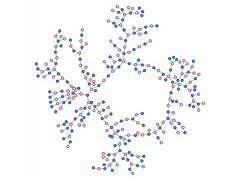
 683 683 | computer graphics (Pajek) 3d layout of 5-regular graph G(3,53) obtained using eigenvectors. Colors of vertices represent distances from the 'Cyan' vertex. |
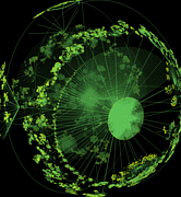
 885 885 | 2002 computer graphics by (unknown) Limiteazero is an architecture, media design and media art studio based in Milan, Italy. Among it's rich portfolio in installation/exhibition design, sound design and new media, they created a Carnivore client with audio/visual feedback, entitled Active Metaphor. The basis of the project is the "Carnivore" engine, a software application that listens to all internet traffic on a specific local network. Carnivore was created by RSG and has won Golden Nica at Ars Electronica and an honorable mention at read_me 1.2. The authors made a script that gets the ip address ("aaa.bbb.ccc.ddd"), and breaks it down into four different groups of numbers ("aaa", "bbb","ccc", "ddd"). These elements are used as coordinates for 3D shapes and blending percentages ("x", "y", "z", "blend"). They choose to work with ip addresses because: "it's the main data that identifies an Internet relationship. Users identify their interaction by requesting ip addresses, even if they're not aware of it. Each ip address flowing over the net could be thought of as a human action, a communication, or an experience." This piece of work lets the user see and hear the data flow, which is something that we normally can't perceive. It allows us to see the net as a huge data field that is constantly moving, like a digital life-form that feeds itself with human interaction. |
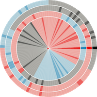
 959 959 | 2002 computer graphics by Marius Watz Marius Watz, Art Director of Generator.x, has used the nom-de-guerre Amoeba since 1995 for experimentation in electronic media, with the web site Evolutionzone.com as the output. In this environment, Watz shows amazing generative art pieces that are both intriguing and captivating. AmoebaAbstracts 1-3, is a set of 3 experiments in abstract computational composition and dynamic form. The abstracts, responsive to user input, were built with Processing for the exhibition "Abstraction Now", Kunstlerhaus Wien, September 2003, and were also exhibited at Sonar 2004, Barcelona. The images shown are representative of Abstract 2, an endlessly emerging geometric pattern. This generative piece of visual abstraction doesn't consider any set of actual data, however, its aesthetical visual depiction represents a fresh approach that might prove inspiring to any network visualization endeavor. |
 337 337 | 1971 Logical network maps charting the growing of sites connecting to ARPANET in the early 1970s. (Sources : "Casting the Net", page 64; CCR, page 93) |
 338 338 | 1971 Logical network maps charting the growing of sites connecting to ARPANET in the early 1970s. (Sources : "Casting the Net", page 64; CCR, page 93) |
 340 340 | 1971 Logical network maps charting the growing of sites connecting to ARPANET in the early 1970s. (Sources : "Casting the Net", page 64; CCR, page 93) |
 339 339 | 1974 Logical network maps charting the growing of sites connecting to ARPANET in the early 1970s. (Sources : "Casting the Net", page 64; CCR, page 93) |
 328 328 | 1969 ASCII text by Elmer B. Shapiro A very simple ascii map of the first network link on ARPANET between UCLA and SRI taken from RFC-4 Network Timetable, by Elmer B. Shapiro, March 1969. |
 358 358 | computer graphics The backbone network of FORTHnet, a major Internet provider in Greece. |
 354 354 | 2000 computer graphics The IP backbone network of BTnet in the United Kingdom, as early 2000. |
 841 841 | computer graphics by Lothar Krempel This diagram represents a large network of co-authorships among 555 scientists. It is a subset of a dataset containing information for 970 people. |
 1248 1248 | Comment Flow2007 software (Java) by Dietmar Offenhuber A browser visualizing conversations via guest book entries across myspace profiles We have designed and implemented a flexible tool for the content driven exploration and visualisation of a social network. Building upon a traditional force-directed network layout consisting of nodes (profiles) and edges (friend-links), our system shows the activity and the information exchange (postings in the comment box) between nodes, taking the sequence and age of the messages into account. This project serves both as an illustration of one approach to the general problem of individuated network visualization and as an example of the practical uses of such representations. In the mySpace service network-only visualization methods are no longer sufficient to meaningfully represent the community structure. Numerous commercial profiles, fake/spam/celebrity profiles and tools such as automated friend adders result in a huge numbers of connections, many of which carry little information about a person’s actual social ties and behavior. The average myspace user has more than 130 friends, but there are also profiles with over a million “friends”. By going beyond the “skeleton” of network connectivity and looking at the flow of information between the individual actors we can create a far more accurate portrait of online social life. |
 1246 1246 | Comment Flow2007 software (Java) by Dietmar Offenhuber A browser visualizing conversations via guest book entries across myspace profiles We have designed and implemented a flexible tool for the content driven exploration and visualisation of a social network. Building upon a traditional force-directed network layout consisting of nodes (profiles) and edges (friend-links), our system shows the activity and the information exchange (postings in the comment box) between nodes, taking the sequence and age of the messages into account. This project serves both as an illustration of one approach to the general problem of individuated network visualization and as an example of the practical uses of such representations. In the mySpace service network-only visualization methods are no longer sufficient to meaningfully represent the community structure. Numerous commercial profiles, fake/spam/celebrity profiles and tools such as automated friend adders result in a huge numbers of connections, many of which carry little information about a person’s actual social ties and behavior. The average myspace user has more than 130 friends, but there are also profiles with over a million “friends”. By going beyond the “skeleton” of network connectivity and looking at the flow of information between the individual actors we can create a far more accurate portrait of online social life. |
 1247 1247 | Comment Flow2007 software (Java) by Dietmar Offenhuber A browser visualizing conversations via guest book entries across myspace profiles We have designed and implemented a flexible tool for the content driven exploration and visualisation of a social network. Building upon a traditional force-directed network layout consisting of nodes (profiles) and edges (friend-links), our system shows the activity and the information exchange (postings in the comment box) between nodes, taking the sequence and age of the messages into account. This project serves both as an illustration of one approach to the general problem of individuated network visualization and as an example of the practical uses of such representations. In the mySpace service network-only visualization methods are no longer sufficient to meaningfully represent the community structure. Numerous commercial profiles, fake/spam/celebrity profiles and tools such as automated friend adders result in a huge numbers of connections, many of which carry little information about a person’s actual social ties and behavior. The average myspace user has more than 130 friends, but there are also profiles with over a million “friends”. By going beyond the “skeleton” of network connectivity and looking at the flow of information between the individual actors we can create a far more accurate portrait of online social life. |
 1249 1249 | Comment Flow2007 software (Java) by Dietmar Offenhuber A browser visualizing conversations via guest book entries across myspace profiles We have designed and implemented a flexible tool for the content driven exploration and visualisation of a social network. Building upon a traditional force-directed network layout consisting of nodes (profiles) and edges (friend-links), our system shows the activity and the information exchange (postings in the comment box) between nodes, taking the sequence and age of the messages into account. This project serves both as an illustration of one approach to the general problem of individuated network visualization and as an example of the practical uses of such representations. In the mySpace service network-only visualization methods are no longer sufficient to meaningfully represent the community structure. Numerous commercial profiles, fake/spam/celebrity profiles and tools such as automated friend adders result in a huge numbers of connections, many of which carry little information about a person’s actual social ties and behavior. The average myspace user has more than 130 friends, but there are also profiles with over a million “friends”. By going beyond the “skeleton” of network connectivity and looking at the flow of information between the individual actors we can create a far more accurate portrait of online social life. |
 1252 1252 | Comment Flow2007 software (Java) by Dietmar Offenhuber A browser visualizing conversations via guest book entries across myspace profiles We have designed and implemented a flexible tool for the content driven exploration and visualisation of a social network. Building upon a traditional force-directed network layout consisting of nodes (profiles) and edges (friend-links), our system shows the activity and the information exchange (postings in the comment box) between nodes, taking the sequence and age of the messages into account. This project serves both as an illustration of one approach to the general problem of individuated network visualization and as an example of the practical uses of such representations. In the mySpace service network-only visualization methods are no longer sufficient to meaningfully represent the community structure. Numerous commercial profiles, fake/spam/celebrity profiles and tools such as automated friend adders result in a huge numbers of connections, many of which carry little information about a person’s actual social ties and behavior. The average myspace user has more than 130 friends, but there are also profiles with over a million “friends”. By going beyond the “skeleton” of network connectivity and looking at the flow of information between the individual actors we can create a far more accurate portrait of online social life. |
 408 408 | computer graphics ContactMap is a prototype information map for visually managing your social network. |
 1046 1046 | 2006 computer graphics by Ian Timourian Ian Timourian (kiddphunk), who runs mandalabrot.net, home of some amazing generative art pieces, has developed del.icio.us.discover, a stunning set of visualizations + explorations into "link-spaces" in the del.icio.us collaborative bookmarking network. It was created with Processing + Perl, using data gathered early March, 2006. The project aims to deliver: 1) direct and abstract visualizations of intra- and inter-user relationships. 2) simple, implementable algorithms to recommend "links-of-interest" that might otherwise be missed by a user currently utilizing only popularity-based link aggregators, and ideas for their further usages. |
 537 537 | computer graphics by Tower Maps A simple dot map of commercial wireless antennas in the USA. The full database of tower locations can be purchased from Tower Maps. |
 372 372 | computer graphics The pan European KPNQwest network, when complete, will connect major cities together by six high-capacity backbone rings. |
 1399 1399 | 2010 by Give Me My Data / Nodebox 1.0 Network graph visualization of Facebook contacts using data retrieved using Give Me My Data http://givememydata.com and Nodebox 1.0. |
 1400 1400 | 2010 by Give Me My Data / Nodebox 1.0 Network graph visualization of Facebook contacts using data retrieved using Give Me My Data http://givememydata.com and Nodebox 1.0. |
 1401 1401 | 2010 by Give Me My Data / Nodebox 1.0 Network graph visualization of Facebook contacts and mutual contacts using data retrieved using Give Me My Data http://givememydata.com and Nodebox 1.0. |
 1402 1402 | 2010 by Give Me My Data / Nodebox 1.0 Network graph visualization of Facebook contacts and mutual contacts using data retrieved using Give Me My Data http://givememydata.com and Nodebox 1.0. |
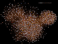 750 750 | 2005 computer graphics by Gustavo G Network analysis of the Flickr population, based on data collected on March 14th, 2005. |
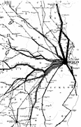
 927 927 | 2005 computer graphics by Doantam Phan, Ling Xiao, Ron Yeh Flow Map Layout is a novel visualization technique seen as a hybrid of graphs and flow maps. Cartographers have long used flow maps to show the movement of objects from one location to another, such as the number of people in a migration, the amount of goods being traded, or the number of packets in a network. One of the most famous flow maps, depicting Napoleon's Russian Campaign, was created by Charles Joseph Minard in 1869, and can be seen here. The advantage of flow maps is that they reduce visual clutter by merging edges. Most flow maps are drawn by hand and there are few computer algorithms available. In Flow Map Layout, the authors present a method for generating flow maps using hierarchical clustering given a set of nodes, positions, and flow data between the nodes. The technique is inspired by graph layout algorithms that minimize edge crossings and distort node positions, while maintaining their relative position to one another. The authors have demonstrated the technique by producing flow maps for network traffic, census data, and trade data. The first image illustrates a close-up of top 15 imports to Spain and France. Notice the branching structure is shared across different nodes, for example Spain, and France branch to the Netherlands, Germany and the UK in the same way. The second image represents an outgoing migration map from Colorado (USA) from 1995-2000, generated by the algorithm without layout adjustment or edge routing. |
 682 682 | computer graphics (Pajek) Snapshot of SVG picture (in Web browser) of football players export. |
 905 905 | 2005 computer graphics by Sheep N. Dalton These images are part of a research done by Sheep N. Dalton in the context of a paper for the Third Space Syntax conference in Atlanta, USA. The paper covers a new theory that can perform new kinds of configurational analysis. The software which performs the analysis is called "Meanda" (Mean Depth Angular) and was developed by Dalton. The project visualizes the network structure of the graph that is formed from the network of streets. This work is derived from a set of network theories in architecture known as "Space Syntax". It is generally found that these colors which are formed from a measurement of graph structure correlate well with observed patterns of pedestrian movement. The first image illustrates London Radius infinity Mean Depth. This is a vehicular map so Oxford street has been removed to represent it's non availability to cars. The second image shows Amsterdam Mean depth. For more information on how fractional analysis is computed click here |
 362 362 | 1999 computer graphics by Garr & Esa/Esrin The backbone network of GARR-B which connects scientific institutions in Italy. |
 1215 1215 | Geospace & Media Tool (GMT): Geolocated news2007 computer graphics by Parsons Institute for Information Mapping (PIIM) This screenshot shows a selected news abstract set in geographical context. GMT Description The Geospace & Media Tool is an advanced information visualization application that ties incoming news flow with geospatial, census, and human network data. Related news articles are scored and aggregated into single, convenient event files. Easy-to-use graphic and geographic visualizations give the user the ability to see events, demographics, rnorganizations and current as well as past professional connections between people. Key features include: Detailed content and metadata on every news article Full dossier of individuals mentioned in every news articlern Ability to track and search events by location, topic, and customized filters Automatic extraction and aggregation of related network and statistical data Visual display of network connections between professionals Access to hundreds of statistical values specifically relevant to each news article, accompanied by map overlays |
 1213 1213 | Geospace & Media Tool (GMT): Human organizational networks2007 computer graphics by Parsons Institute for Information Mapping (PIIM) This screenshot shows the relationships among individuals as a human organizational network diagram. GMT Description The Geospace & Media Tool is an advanced information visualization application that ties incoming news flow with geospatial, census, and human network data. Related news articles are scored and aggregated into single, convenient event files. Easy-to-use graphic and geographic visualizations give the user the ability to see events, demographics, rnorganizations and current as well as past professional connections between people. Key features include: Detailed content and metadata on every news article Full dossier of individuals mentioned in every news articlern Ability to track and search events by location, topic, and customized filters Automatic extraction and aggregation of related network and statistical data Visual display of network connections between professionals Access to hundreds of statistical values specifically relevant to each news article, accompanied by map overlays |
 1214 1214 | Geospace & Media Tool (GMT): Statistics2007 computer graphics by Parsons Institute for Information Mapping (PIIM) This screenshot shows census data for a selected congressional district. GMT Description The Geospace & Media Tool is an advanced information visualization application that ties incoming news flow with geospatial, census, and human network data. Related news articles are scored and aggregated into single, convenient event files. Easy-to-use graphic and geographic visualizations give the user the ability to see events, demographics, rnorganizations and current as well as past professional connections between people. Key features include: Detailed content and metadata on every news article Full dossier of individuals mentioned in every news articlern Ability to track and search events by location, topic, and customized filters Automatic extraction and aggregation of related network and statistical data Visual display of network connections between professionals Access to hundreds of statistical values specifically relevant to each news article, accompanied by map overlays |
 611 611 | 2005 computer graphics by TeleGeography |
 366 366 | computer graphics The Internet infrastructure of Golden Telecom in Russia. |
 378 378 | 1997 computer graphics by John Neystadt Israeli ISP backbone map. |
 654 654 | computer graphics by Valdis Krebs Software for Social Network Analysis & Organizational Network Analysis |
 368 368 | computer graphics A map of the Interoute i-21 network spanning much of Europe. It is a nice example of the use of a subway map metaphor. |
 412 412 | computer graphics An interesting network metaphor as a visual interface to search engine results. |
 809 809 | 2004 computer graphics by Jeffrey Heer This image is a visualization of Jeffrey Heer's personal friendster network to 3 hops out, an online social network consisting of Jeffrey, his "friends", his friends' friends, and his friends' friends' friends. The resulting networks consist of 47471 people connected by 432430 friendship relations. The data was collected during the timespan of October 2003 to February 2004 as part of the Vizster project. The images were created using the prefuse visualization toolkit. Nodes are colored by proximity to the center of the network (which in this case is Jeffrey Heer himself). The central person is the brightest, that person's friends next brightest and so on. The elements are also ordered so that friends and relations closer from the central person are drawn on top of more distant relations and people. The graph layout was computed using a standard force-directed layout method in which nodes exert anti-gravity against each other and the edges are treated as springs. |
 1010 1010 | 2006 computer graphics by Ben Fry As part of its 2006 February 20 Issue, dedicated to "The Blog Establishment", New York Magazine commissioned Ben Fry to map the connections between the most-linked-to 50 blogs, using data from Technorati. Each arrow represents a hypertext link that was made sometime in the previous 90 days. The Blogosphere encompasses a vast communication network of interconnected individuals (bloggers) who are linked by shared interests and patterned flows of information. Links between blogs (blogrolling) represent recognition votes in an endless global popularity poll. Some top-50 sites don't have any links from the others shown here, mainly because they are from countries other then the USA, such as Japan, China, Spain or Germany; and therefore, they have a tendency to remain within their immediate linguistic/cultural community. On the top 3 popularity list is Boing Boing, Engadget and PostSecret. For an updated listing on Technorati click here. |
 902 902 | 1933 computer graphics by Harry Beck The father of all subway maps, the London Underground map, was the brainchild of Underground electrical draughtsman, Harry Beck, who produced this imaginative yet stunningly simple design back in 1933. Beck based the map on the circuit diagrams he drew for his day job, stripping the sprawling Tube network down to basics and ignoring the exact geographical location of the tube stations. The result was an instantly clear and comprehensible chart that would become an essential guide to London - and a template for transport maps the world over. Beck's revolutionary design, with certain modifications and additions, survives to the present day and is set to serve London Underground and its millions of customers for many years to come. The first image represents Beck's original map from 1933, while the second image shows the most up-to-date version of the London Underground map. To view the map according to its accurate geographical location click here. |
 679 679 | computer graphics (Pajek) Main core subgraph extracted from routing data on the Internet network (124651 vertices, 207214 arcs). |
 386 386 | 1998 computer graphics Map of UUNET's UK backbone network from mid 1998. [For more information on this map see the Map of the Month article "Maps to Market Your Network" in Mappa.Mundi Magazine.] |
 262 262 | 1999 computer graphics by Teleglobe, Inc. The cable and satellite infrastructure of Teleglobe Inc., a global telecommunications corporation, as of November 1999. |
 1019 1019 | 2006 computer graphics by Mark Miller Brains are gorgeous at the right magnification, says Mark Miller on his "neuro" set of photos in flickr. Self-described as an intracellular recording artist, Miller in this set shows 17 striking images of a mouse's neuronal network. Covering different areas of the brain such as the cingulated cortex or motor cortex, the images are quite impressive, particularly since the neurons connecting in the brain resemble the large-scale structure of the universe. See the Millennium Simulation to better understand this noticeable similarity. Other representations of neuronal networks can be seen here and here. |
 348 348 | 1991 computer graphics by Merit Network, Inc The NSFNET infrastructure and topology in 1991. (Source : NSFNET postscript maps from ftp://ftp.uu.net/inet/maps/nsfnet/.) |
 1059 1059 | 2006 computer graphics by (unknown) 2,147,483,647 web pages ('nodes') were numbered and arranged in a Binary Search Tree. For each page the traffic of the three major search bots (Yahoo! Slurp, Googlebot and msnbot) was monitored over a period of one year (between 2005-4-13 and 2006-4-13). Each search engine's behavior was visualized as a tree image that represents which nodes were crawled. Each line in the image represents a node, the number of times a search bot visited the node determines the length of the line. As part of the results, the authors found Yahoo! Slurp to be the most active search bot and the first search engine to discover the Binary Search Tree experiment. In the first hours after discovery it crawled the tree vigorously, at a speed of over 2.3 nodes per second. The image shown represents the resulting tree of Yahoo! Slurp crawling over 1 year. |
 680 680 | computer graphics (Pajek) p-graph of the largest component in the genealogy of American presidents with shortest path between G.H.W. Bush and F.D. Roosevelt. |
 319 319 | 1995 computer graphics by Evangelos P. Markatos and Athanasios E. Papathanasiou, Institute of Computer Science (ICS), Foundation for Research & Technology - Hellas (FORTH), Crete. |
 965 965 | 2003 computer graphics by bdcconseil The Paris Metro was originally known as the "Chemin de Fer Metropolitain" ("Metropolitan railway"), then "Metropolitain," quickly abbreviated to "Metro". Inaugurated in 1900, it is one of the oldest subway systems in the world, and the second biggest in number of stations, right next to New York City. The system consists of 16 lines, identified by numbers from 1 to 14, with two minor lines 3bis and 7bis, numbered thus because they are branch lines split off from their respective original lines. The Paris Metro network has 221.6 km (137.7 miles) of track and 380 stations (87 offering connection between lines). Most of the network was built from 1900 to 1939. After the war, most extension focused on the RER, a metropolitan express subway system. The images shown here are representative of the latest re-design of the Metro map, produced by the design agency bdcconseil (http://www.bdcconseil.com) in 2003. Click here to see the Paris metro network pictured at a geographically accurate scale. |
 875 875 | 2004 computer graphics by Jodi Dean, Zachary Devereaux and The Govcom.org Foundation, an Amsterdam-based organization dedicated to creating and hosting political tools on the Web, and its collaborators have developed a software tool that locates and visualizes networks on the Web. The Issue Crawler, at http://issuecrawler.net, is used by NGOs and other researchers to answer questions about specific networks and effective networking more generally. One may also do in-depth research with the software. This image represents the entangled network of the most popular political blogs on the net. The graph build with Issue Crawler was produced by John Hawkin for issuenetwork.org (the workshop site by the Govcom.org Foundation), using a list available at rightwingnews.com that can be seen here. Source: News about Networks, workshop by the Govcom.org Foundation, de Balie Center for Culture and Politics, Amsterdam, 21-24 June 2004, with support from the Ford Foundation, New York, (http://www.issuenetwork.org/node.php?id=47). |
 896 896 | computer graphics by Hawoong Jeong |
 310 310 | computer graphics by Stephen E. Lamm and Daniel A. Reed, Department of Computer Science, University of Illinois, USA |
 311 311 | computer graphics by Stephen E. Lamm and Daniel A. Reed, Department of Computer Science, University of Illinois, USA |
 312 312 | computer graphics by Stephen E. Lamm and Daniel A. Reed, Department of Computer Science, University of Illinois, USA |
 1061 1061 | 2006 computer graphics by Moritz Stefaner Moritz Stefaner is the author of the original and engaging Relation Browser, one of the most successful projects featured in VC. Not only is the idea of visualizing the CIA World Factbook in that manner quite innovative, but it also provides an interesting approach for navigating networks, by revealing small clusters at a time. Besides that, Relation Browser is simple, smooth and quite compelling to use. But Moritz has not stayed there. Among several other projects, this small flash experiment has such a great impact for interacting with any complex network. Again, by being able to reveal small groups of nodes at a time with correspondent linkage, it brings a fresh method that has a great potential for numerous applications. |
 731 731 | computer graphics by James Moody |
 681 681 | computer graphics (Pajek) Reordered matrix representation (using Richard's numbering) of 3-neighbourhood of the word write. |
 684 684 | computer graphics (Pajek) |
 846 846 | 1998 computer graphics by (unknown) Map of the entire Stuttgart VVS rail network. |
 476 476 | 1996 computer graphics The evolving topology of SuperJANET, the high-speed academic network in the UK. This map shows the ATM network circa September 1996. |
 477 477 | computer graphics The evolving topology of SuperJANET, the high-speed academic network in the UK. This map is a schematic map of the backbone topology of SuperJANET III from early 1998. |
 490 490 | 2001 computer graphics The evolving topology of SuperJANET, the high-speed academic network in the UK. This topology map shows the new SuperJANET4 backbone, as of March 2001. |
 382 382 | 2002 computer graphics The SWITCH network, the national academic and research network in Switzerland. |
 330 330 | 1969 drawing by Alex McKenzie The first node on ARPANET at University California Los Angeles (UCLA) on the 2nd of September 1969. (Source : "Casting the Net", page 55) |
 980 980 | 2003 computer graphics by Ed Blanchfield Ed Blanchfield used a Firewall/Intrusion Detection System (IDS) log data to get "before" and "after" graphs showing the impact of an MS-SQL worm, which hit the Internet around January 25th 2003. When this particular worm hit a large class B sized network, an IDS system designed and implemented by Blanchfield for a large managed services provider, was one of the first sites in the world to detect and report the incident. Ed posted his original findings and info to various security lists and quickly wrote up a parser to create GDL files from Firewall and IDS logs, which he fed into aiSee Graph Layout Software in order to visually map this worm's effect on their customer's network. The first image is a visualization of log data for a class B firewall without background worm traffic, while the second represents the same data with background worm traffic. The graphs show just 15 minutes worth of traffic at midnight, but the impact of the worm is already clearly visible. You can imagine what 24 hours must have been like. |
 370 370 | 2000 computer graphics by The JNT Association The backbone of JANET, the UK academic and research network as of the spring 2001 (sic). |
 376 376 | 1999 computer graphics The London MAN (metropolitan area network) of SuperJANET - the UK's high-speed academic and research network. This map sows the topology of the network in May 1999. |
 1408 1408 | UK Road Traffic Accidents: A Leading Killer2012 Image by Pannone |
 934 934 | 2000 computer graphics by Karl Bilimoria, Banavar Sridhar An efficient and effective air traffic management system is vital to the U.S. transportation infrastructure. Since 1978, when the airline industry was deregulated, the inflation adjusted gross domestic product (GDP) has increased by 62 percent. In this same time period, total output of scheduled passenger air transportation (as measured by Revenue Passenger Miles) has increased by 190 percent and total airfreight ton miles have increased by 289 percent. Since 1997, flight delays have skyrocketed - doubling in only four years. These trends are expected to continue. In 1998, airline delays in the U.S. cost industry and passengers $4.5 billion -- the equivalent of a 7 percent tax on every dollar collected by all the domestic airlines combined. These screenshots are from an quicktime animation created with Future ATM Concepts Evaluation Tool (FACET) by NASA. It represents a day in the life of Air Traffic over the continental USA. The animation illustrates critical patterns on major airports and it's quite interesting to notice the different traffic intensity throughout the day. For more information one can read the paper here. |
 508 508 | computer graphics This is the weather map for the GRNET, the education and research network for Greece. Clicking on individual link arrows brings up more detailed traffic graphs. |
 503 503 | computer graphics Weather maps can also use non-geographic, topological diagrams to represent the network structure. This example diagram shows the traffic load on the GARR-B network in Italy. |
 325 325 | computer graphics by Sensorium WebHopper was an experimental mapping of Internet traffic in real-time. |
 326 326 | computer graphics by Sensorium WebHopper was an experimental mapping of Internet traffic in real-time. |
 501 501 | computer graphics (WhatRoute) by Bryan Christianson WhatRoute, a graphical and geographical traceroute utility for the Mac created by Bryan Christianson, IHUG. |
